Truth, Fantasy, and Fiction
I created a pinterest board with the exam theme in mind. I was able to amass a large number of images relative to the topic. I will continue to add to this and hopefully it will allow me to draw inspiration for my later development within the topic.
Task 1 - Absurd
|
|
|
In class we looked at the work of Erwin Wurm, in particular his 1 minute sculptures in which he gets people to pose with objects in unlikely ways. This method of creating a sculpture or a pose which seems impossible and holding it for a minute links into the theme of truth fantasy and fiction through the way these temporary illogical things are captured photographically forever. We first sketched our ideas and then went around the school creating the sculptures and filming them for 1 minute, the method which Erwin Wurm uses in creating his pieces. We found that the most effective sculptures were those which were more simple and the best images and videos were those with the subject's whole body in shot. I do not believe that our work was as effective as Wurm's work due to the relative possibility of our sculptures however I think there's a real element of fantasy within the 1 minute sculptures we made.
|
|
|
|
|
|
Task 2 - Glitch
This video by Band Fujiya & Miyagi is an example of 'glitching'; the process of digitally corrupting photos, in this case videos, to the point where the broken images are interesting and in some cases makes the images look even better than the original. In the video above they use the glitching to great effect by hugely distorting the truth and through this creating a fantastical version of reality which matches the music to generate a bizarre yet effective piece of work.
|
|
|
For the next task we looked at digitally manipulating images outside of photoshop and similar photo editing tools. Using text edit and audacity, two programs not made for editing images, we looked to create a 'glitched' effect by changing aspects of the images. This idea of doctoring the images is a way of misrepresenting the real truth of the image and creating something out of fantasy. This way of editing was more of a way of sabotaging the images for which there was a fine line between a good looking image and a completely ruined image. Below is the image I used for my glitching, I thought it would be useful because of the portrait, the blue sky and the interesting background.
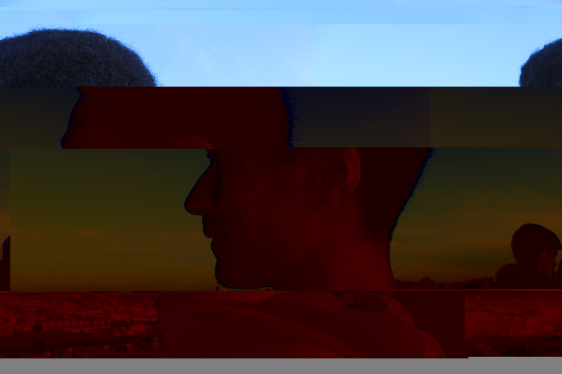
This was my first attempt of glitching the image using text edit and I think it was not very effective in portraying my intention to create something fantastical because I think its more of a filter than anything else, after this failure using text edit I decided to see if I could use Audacity to create anything better. Audacity is primarily a music program however if you follow the instructions below you can see how it can be used to edit images.
Here are some of the other ways I edited the image, they were much more effective than those I did using text edit. My personal favourite of these below is the one where his chin is elongated as I think this really stretches the image to the limit of fantasy while still having different aspects of the truth.
I then experimented with editing the glitched images with the original. I liked the way in which the glitched and the original image contrast each other linking it to the theme through the way in which there is the truth of the original image and the complete fiction of the glitch.


Task 3 - Unposed Truth
Garry Winogrand

|
|
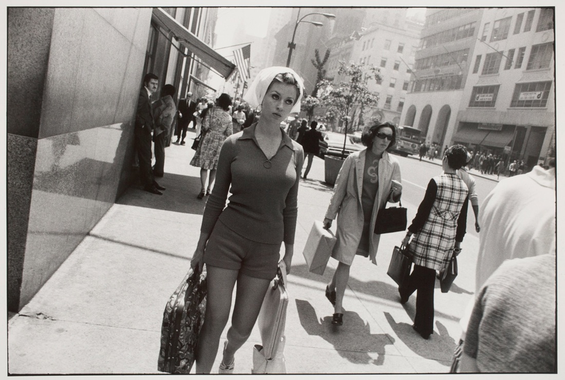
Garry Winogrand was a freelance photographer that lived in Los Angeles from the 1950s up until his death in 1984. He would walk around the streets of LA and when the correct composition arose he would quickly take his picture, so that his subjects were unaware while the image was being taken. This way of capturing people who do not know their being photographed allows the images to portray the real truth of the situation in front of the camera lens, unlike a lot of images in which the subject is aware, and therefore posing in some way. Looking at the work of Winogrand I travelled to central London, around Trafalgar and Leicester Square, places in which large crowds of people gather. I hung my camera around my neck and pressed my shutter release when I believed a good image presented itself in front of me. The fact that I was not looking through the viewfinder created many problems as I could not see what was in frame and what wasn't. As well as this it was important to use the right shutter speed as I was capturing people walking past me while I walked past them, meaning many of the images were blurred. Some of my images are similar to Winogrand's in the way they capture the unknowing subjects however if I did this shoot again I would definitely work out the correct shutter speed, exposure and iso before shooting as I encountered many problems with these throughout my shoot.


Vogue 100 - A Century of Style
Over the half term I visited Vogue 100 - A Century of Style, an exhibition at the National Portrait Gallery celebrating the centenary of the fashion magazine Vogue. The exhibition documented the 100 years that the publication had been in production with a room for each of the 10 decades. The relevance it has to the theme of truth, fantasy, and fiction is the way in which fashion photography is normally a rigorously composed scene in which every aspect is brought into consideration, if not while shooting then afterwards in the editing process. In many cases there are images which look like they've come straight from the realms of fantasy, whereas in others they attempt to capture the very basic truth of the model and/or their clothing. One of the reasons I believe fashion photography is a good place for inspiration is due to the ridiculous amount of money within fashion which means they attract some of the very best photographers which often means that you get very exceptional images, be it their composition or ideas.
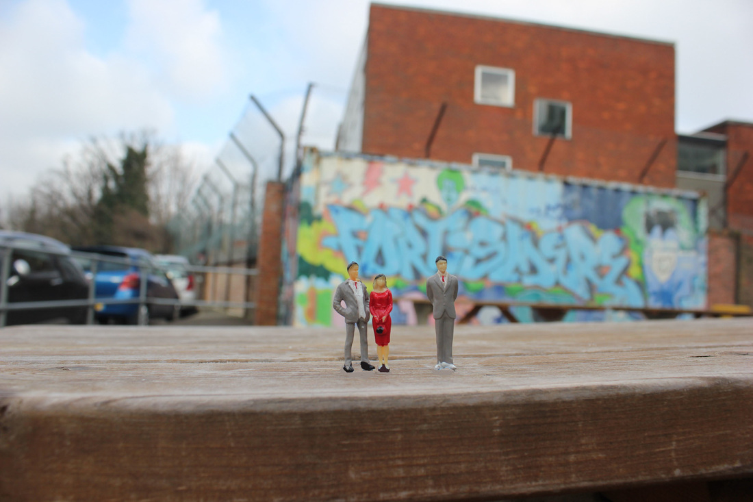
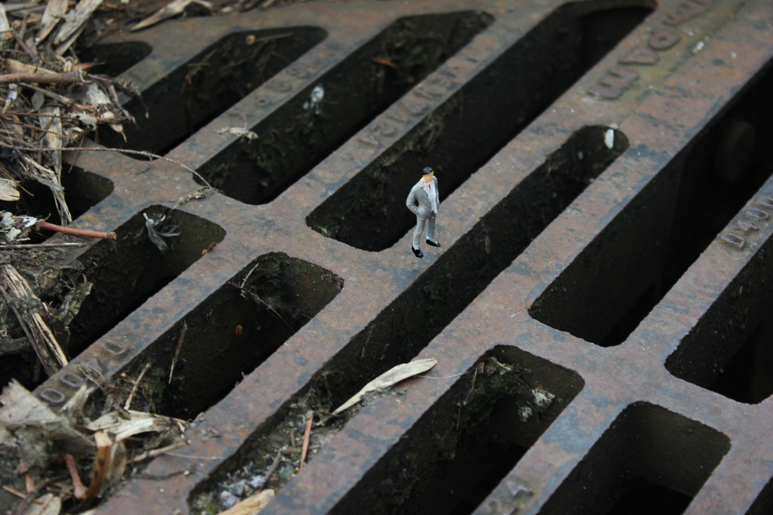
Task 4 - Small Becomes Big
|
|
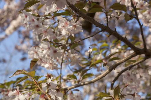
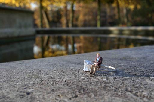
Focusing on the theme of Fiction we looked at the work of artist and photographer Slinkachu who in his series Little People looks at the idea of turning small into big. He does this by using small model railway models and shooting them from such a low angle that they seem to be relatively relational with the world around them, though they are in fact minute in comparison. We walked around the school grounds with our little people and took shots of them in the style of Slinkachu, with the intention of creating images similar to his own that create a juxtaposition between both; small and large, and true and false. Because of how small the figures were I had to use manual focus with almost all of the images as the auto focus of the camera couldn't recognise the subjects. We used blue tack to secure the figures in the different scenes so I also had to edit this out to make it seem more realistic.
|
|
Task 5 - Big Becomes Small
|
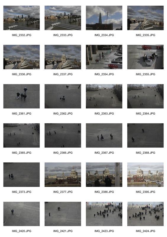
I next looked at the technique of tilt-shift. This is when you use editing tools to make a shot of a large space seem like a small model, in the complete opposite way to the shots above, in which I tried to make the small models seem large. By doing this you are turning truth into supposed fiction through changing the real landscape into something that seems like a model through the tools of photoshop. Using the method shown in this video I first edited some generic images to get to grips with the editing process. I then travelled to the Tate Modern, where it's possible to get a high vantage point and take images that would be possible to apply the tilt-shift effect to. I found that, especially with my own images, it is much easier to get a better image with buildings compared to people or crowds. I think this is because they are normally large blocks that have clear and defined edges, meaning you know where to end blurring.
|
|
|
|
Performing for the Camera
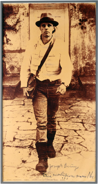
I visited Performing For The Camera at Tate Modern, an exhibition looking at the relationship between photographer and subject, which, in many of the images are synonymous. It looks at how whenever we are having an image taken of us, we are always performing, be it a passport photo or a school portrait. As well as this it looks at how we publish our images through instagram, facebook, and all the other forms of social media, how we differ between truth and fiction when presenting ourselves in front of the camera. The show stretches much further back from the internet age, going right back to the invention of consumer photography with the 19th Century ballet dancers giving different poses to the photographer, through to the work of people like Cindy Sherman dressing up as different people provoking the idea of fantasy in the way she presents herself. My favourite of the rooms was that which contained the work of Joseph Beuys and Andy Warhol (below), the room had posters from both artist's shows, most of which were very over the top, in some cases self-parodic. Of these images the one I like the most is that of Beuys dressed in the shirt and hat walking towards the camera. I particularly liked this image because of the way he is framed with his whole body captured as well as how he is strutting towards the camera, posing as he walks. The way in which he uses sepia and high contrast makes some parts of his body blend into the background whereas other parts, such as his head, stand out more than they normally would.
|

|
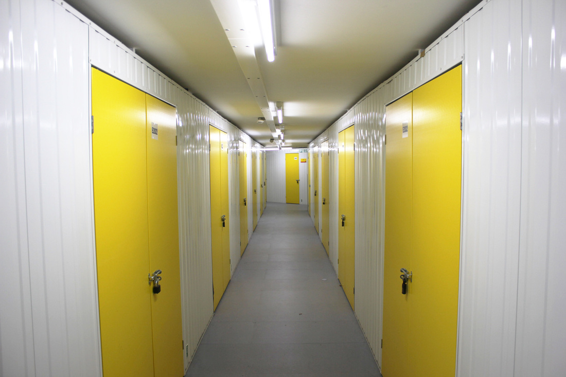
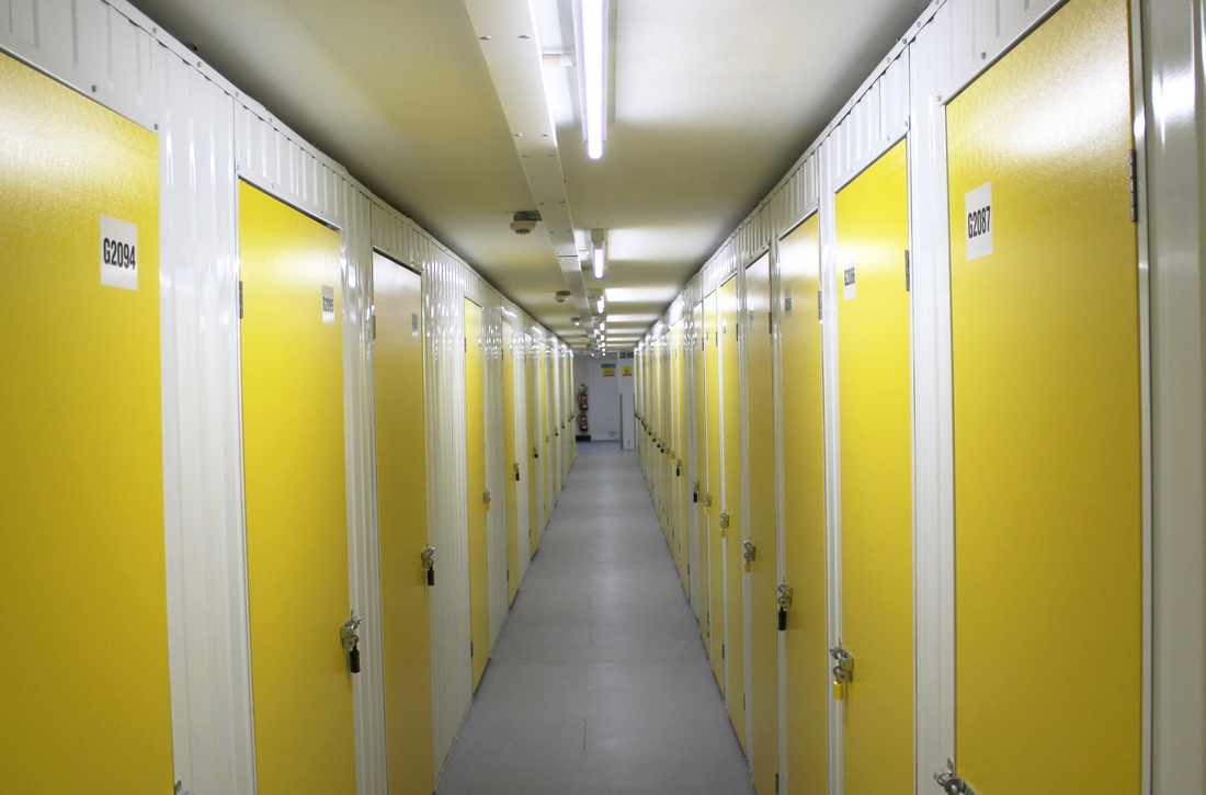
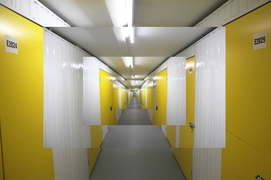
Daniel Crooks - Strand 1
|
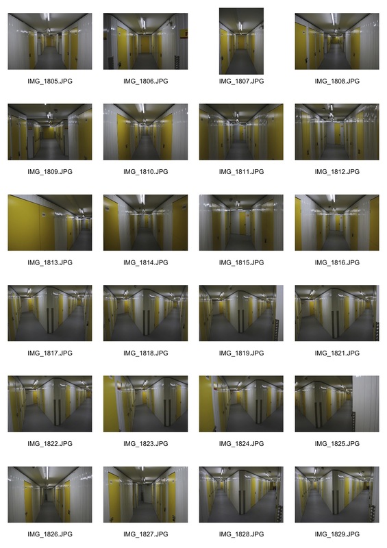
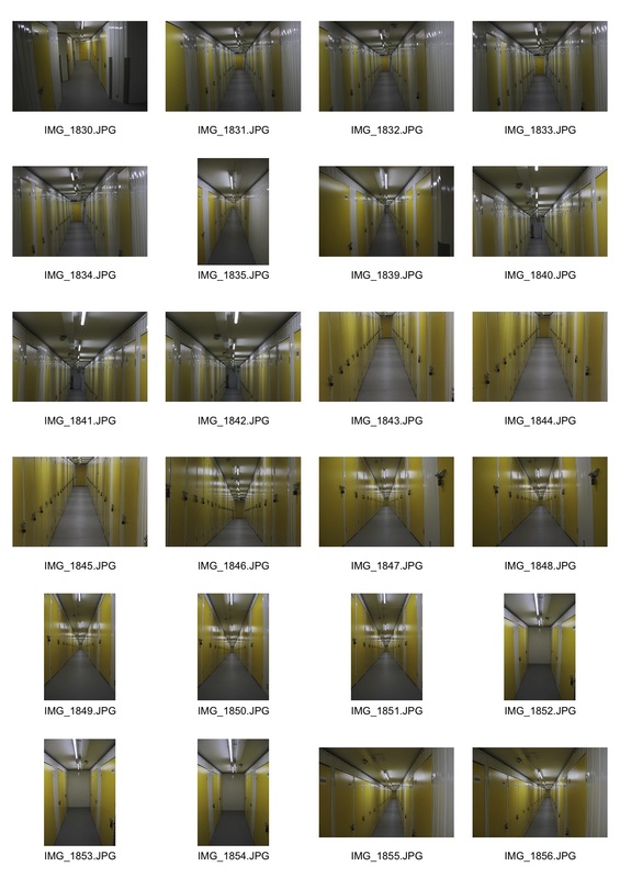
Continuing the project I looked at the work of Daniel Crooks who created this film in which he edited together different films of corridor-type walks, enclosed by two walls. This way of creating a fictional passage way is created by shooting and editing the clips in such a way that the borders of each shot align perfectly to emerge the viewer into the journey through the different locations. I travelled to the Big Yellow Storage in North Finchley and it reminisced me of a futuristic spaceship with its maze-like passageways. I then attempted to edit my images from the warehouse in a similar style to Daniel Crooks', linking in with the theme of truth, fantasy, and fiction by creating a fictitious space through combining images.
|
|
|
|
I chose the images that I wanted to edit together through those with similar features; the height, zoom length, as well as the general composition of each. Once I had chosen the images I edited them in photoshop, adjusting their levels, lowering their contrast and increasing their brightness, which I think gives the images a simpler yet effective impact, through the cleaner colours, shapes, and lines which the lower contrast and higher brightness give you. I then had to choose in which order I would like to place the images, bearing in mind that I had to create a relatively convincing yet still fantastical corridor, in a similar style to Daniel Crooks.

|

|
|
|
Edward Weston- Strand 2
|

|
|
|
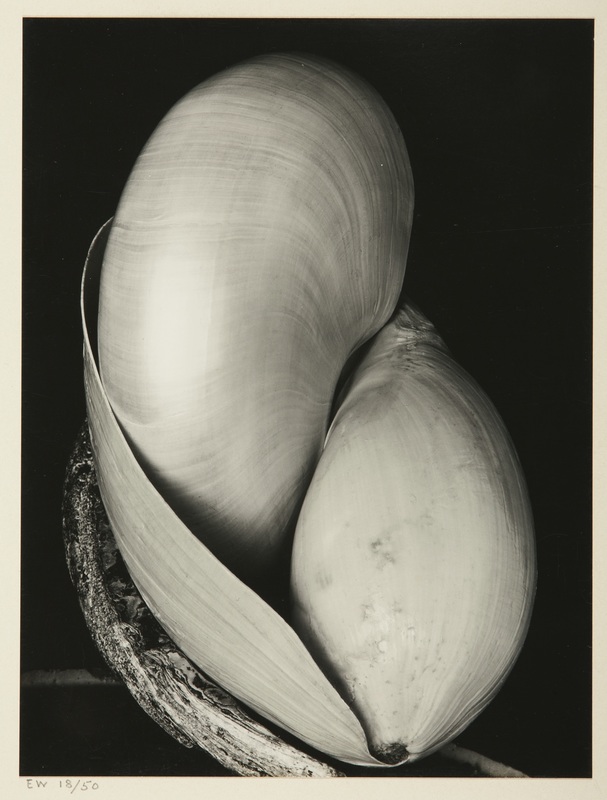
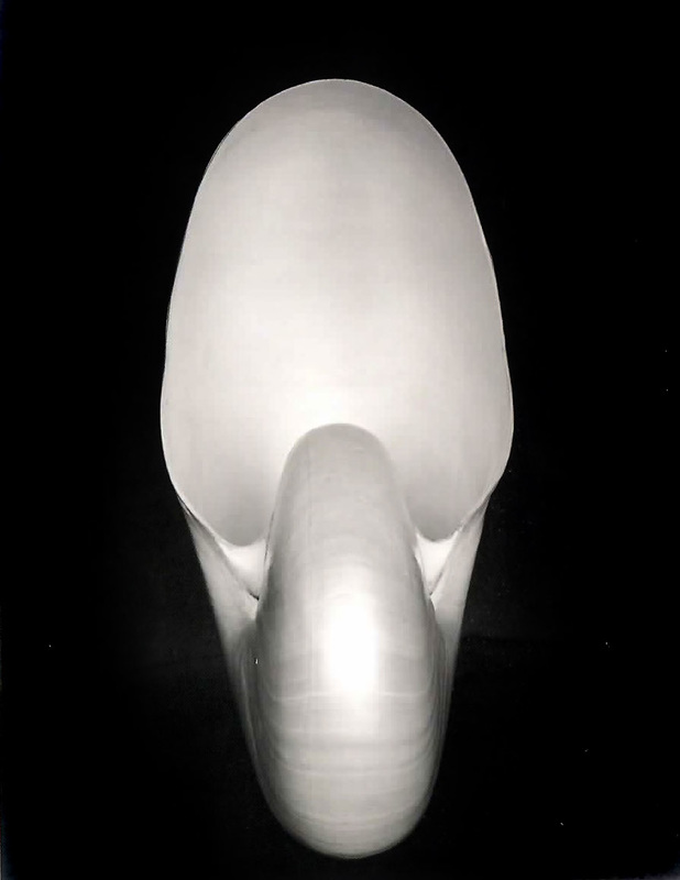
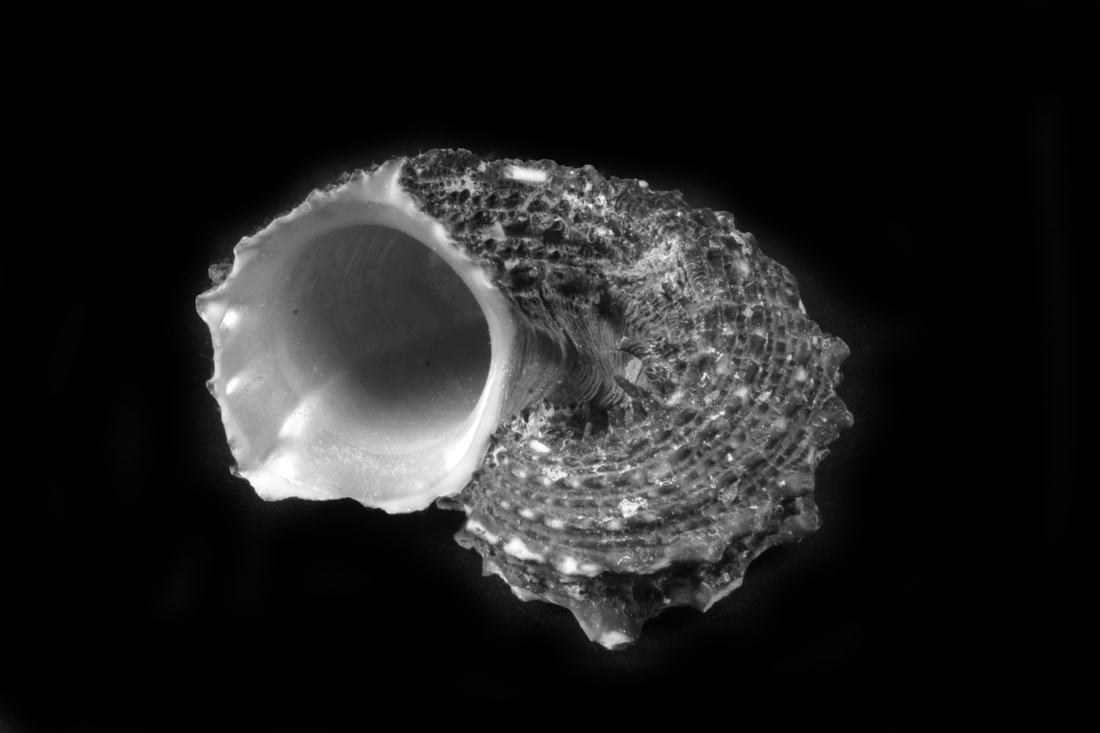
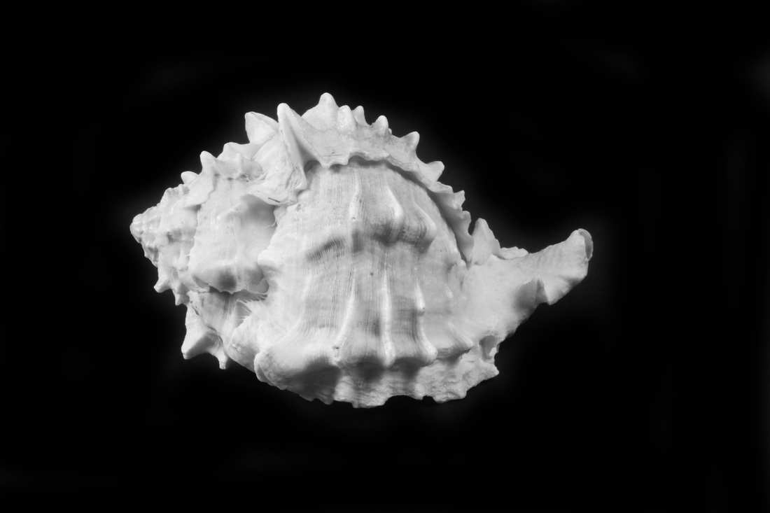
Edward Weston was an American photographer and is often regarded as "one of the most innovative and influential photographers…" and "one of the masters of 20th century photography." He was part of the famous group f/64 along with Ansel Adams, Willard Van Dyke and more. This group of photographers who worked together mainly in the 1930s had gained this name through the fact that they used an extremely small aperture which allowed them to capture amazing detail within the things the were photographing. This way of capturing every minute detail allows the viewer to see the absolute truth, with nothing edited out or lost due to too fast a shutter speed or too shallow a depth of field. Using studio lights and a tripod I attempted to capture some images with similar detail to Weston's. It took a while to get the correct settings and I realised that the images' quality were increased by lowering the iso as well as increasing the f/stop. Unlike Weston's camera the highest aperture my camera reached was f/29, far from his f/64 this meantI could never get the same detail. In photoshop I slightly tweaked the contrast and made the background of each image flat and black similar to Weston's.
|

|
Rut Blees Luxemburg - Strand 3
|
|
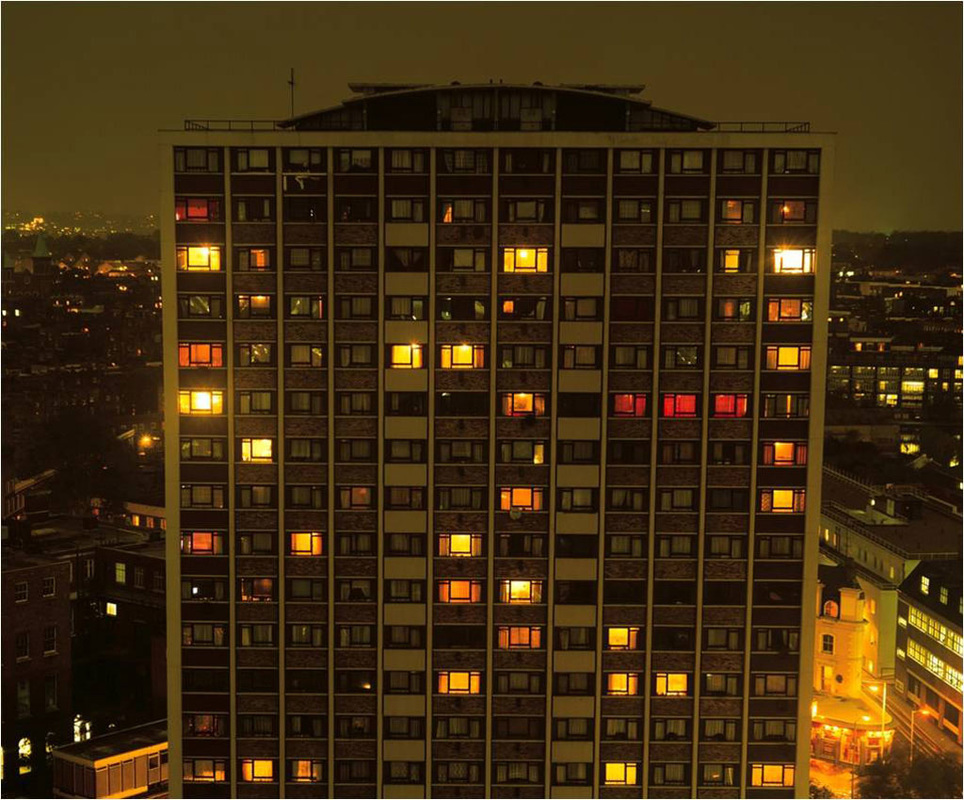
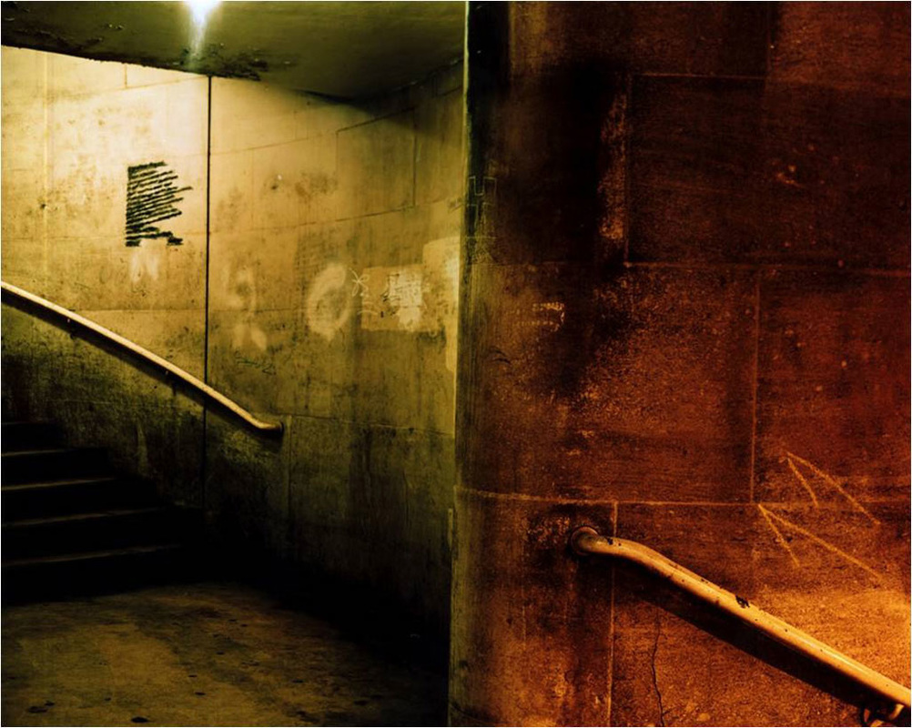
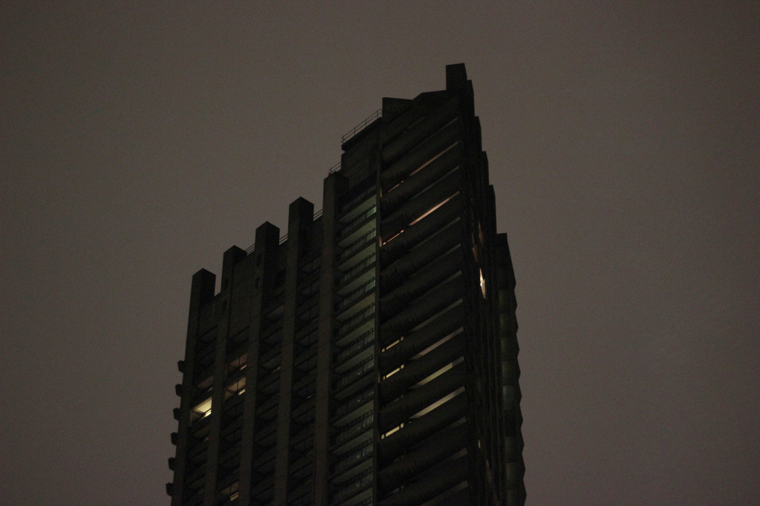
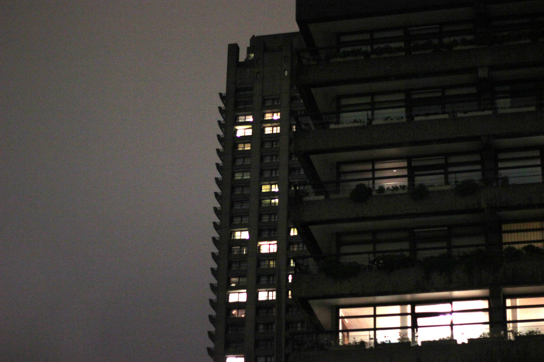
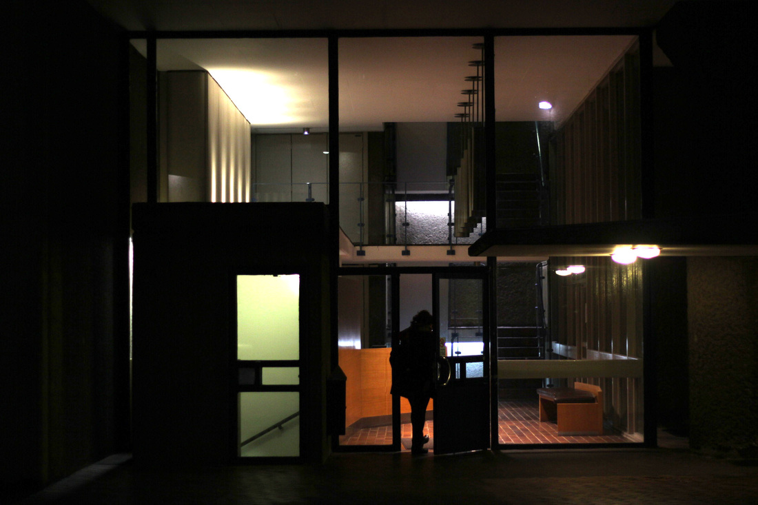
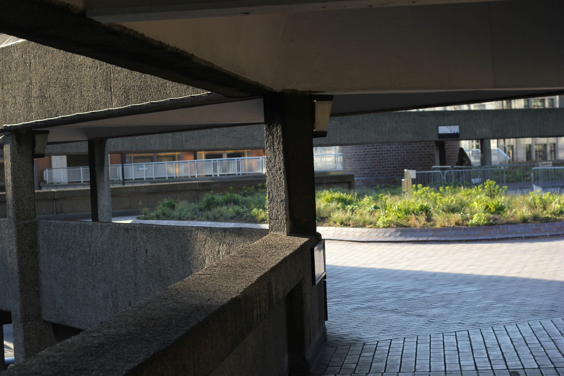
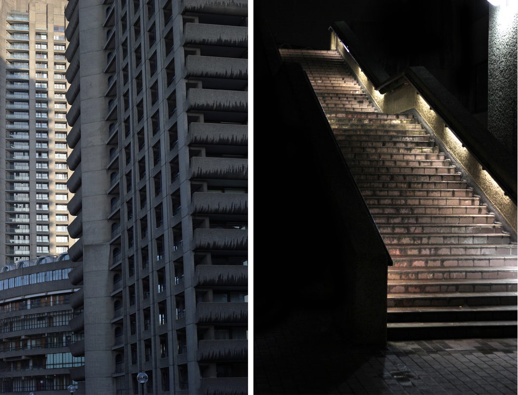
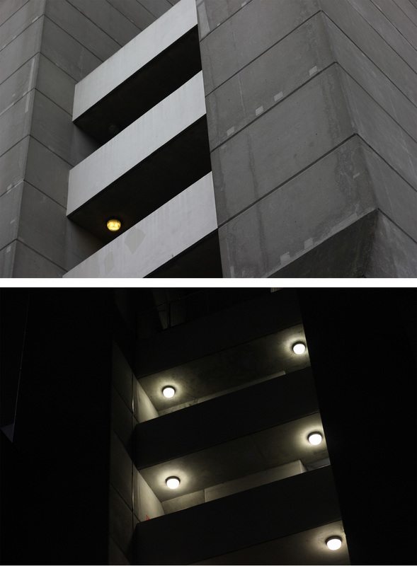
Rut Blees Luxemburg is a German photographer who gained fame when her image Towering Inferno was used as the cover art of The Streets' album Original Pirate Material. The image of a council flat pictured at night brought out the beauty created by the different windows lit up creating blocks of yellow and orange light, creating an idea of fire within the viewers mind, this slightly fantastical side to the image is the case wit many of her images which is why I thought she fit in well to the theme of Truth, Fantasy, and Fiction. In lots of her work she looks at ways to use architectural features to create patterns which you wouldn't normally look for. I visited the Barbican, a housing estate built in the 1960s and 1970s in an area of Central London badly bombed in WWII. The entire estate is built in the brutalist style and throughout the buildings there is an enormous feel of continuity. I went at night trying to create similar images to Luxemburg, however, stupidly, I forgot to bring a tripod with me which meant that a lot of my images came out blurry or jumpy. However I did bring my 50mm prime lens which allowed me to got to f/1.6 therefore allowing me to capture better pictures in the darkness.
Response
|
|
|

|
RUT LUXEMBURG ==> DARKNESS OBSCURING REALITY ==> BARNICAN AT NIGHT
Claudia Eschborn
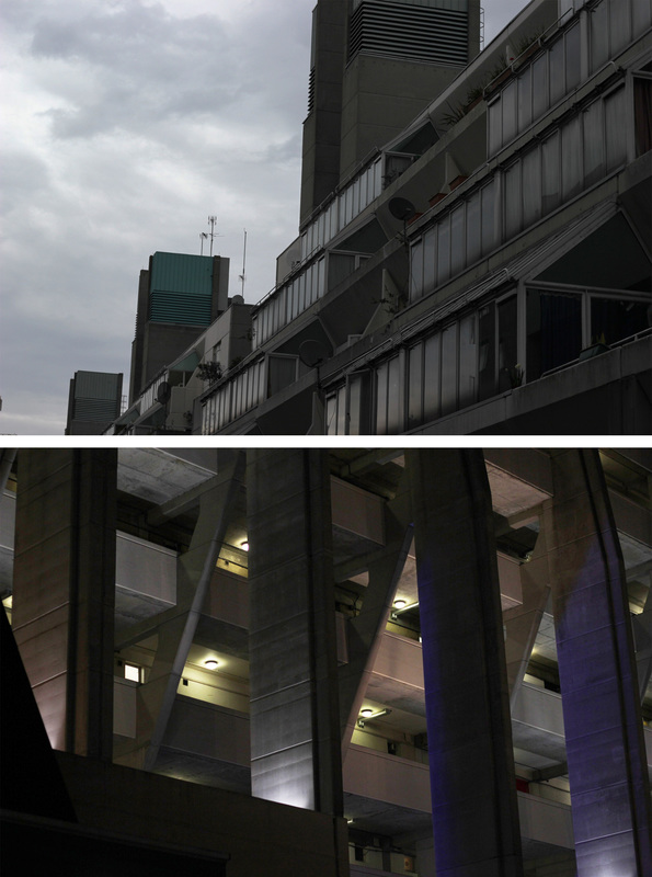
Claudia Eschborn is another female German photographer who in her photos looks at patterns and repetitive features. In her work above she takes images of doors and empty or blocked shop windows and presents the images together to give a strong feeling of continuation as well as allowing the viewer to compare and contrast the two images drawing together similarities and differences. Over the weekend I went back to the Barbican however this time I returned during the day in order to capture it in, literally, a different light. Unlike my previous shoot I was able to capture much more detail in my images which allowed me to gain much more of an insight into the way the brutalist style is presented in the buildings within the estate. Now that I had images of the estate in both darkness and daylight I decided to edit them together to look at how the lights change, during the day, when you can see every detail, the absolute truth. Compare this with the night, when everything is shrouded in darkness taking away much of the truth within the images.
Response
|
|

|

|
DARKNESS OBSTRUCTING REALITY ==> CLAUDIA ESCHBOURN ==> JUXTAPOSITION BETWEEN DARKNESS OF NIGHT AND REALITY OF DAY
Response 2
After what I believed was an interesting and good-looking development above in the style of Claudia Eschborn I decided to create another response in her style. This time I travelled to The Brunswick Centre in Bloomsbury, London, a residential and commercial complex built between 1967-72. The centre is built in a similar Brutalist style to the Barbican centre that I studied in the previous sets of observations. This time, instead of going to the same location on two separate occasions I went during the day, at around 6pm, took my first set of observations then watched a film at the cinema in the centre, and by the time the film had ended, around 9pm, the sun had set and it was sufficiently dark to create the images I intended. As before, I wanted to create a juxtaposition between images of the same buildings in day and night, creating two different types of truth, with the slightly more mysterious truth of the night and the almost absolute truth of the day. When I went to the centre it was more cloudy and grey than I would have liked so the lighting was not as good as my shoot at the Barbican. The Brutalist style of the centre was what I thought made the images effective, the dynamism of the ventilation towers, the patterns created by the stairwells, supports, and tiered windows allowed the images to reflect the architectural style. With the images I edited the contrast and brightness in order to make the buildings seem heavier in a sense, trying to bring out the characteristics of the subjects of the images. Overall I did not think the images were as good as those from the Barbican, mainly because there was much less to photograph, building-wise.
|
|
|
|
Response 3
|
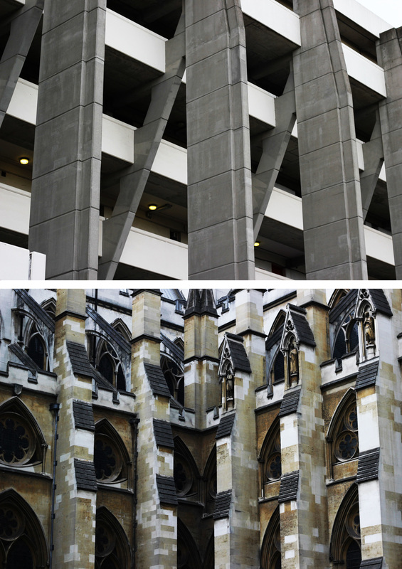
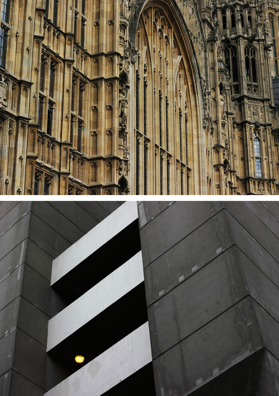
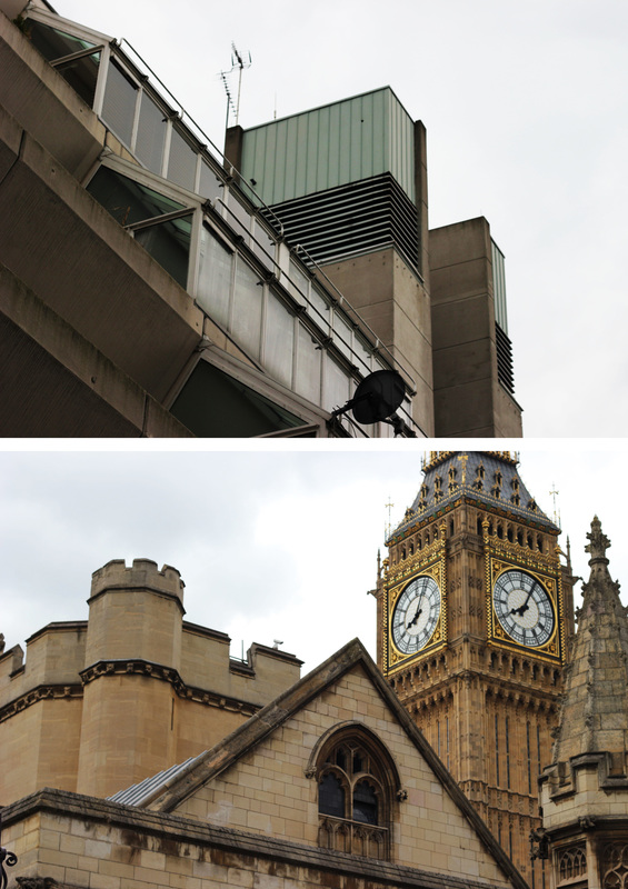
For this next response to Claudia Eschborn I traveled to Westminster, to the houses of parliament. Unlike my previous visits to the Barbican and the Brunswick centre, I was looking at older architecture that I could juxtapose with my images from those shoots. Though it was a completely different architectural style to the Brutalist building I was studying before, I used the same techniques to capture the different features of the buildings. Those techniques were; capturing high spires and towers, trying to fill the frame with the building leaving no sky, looking at supports of the structures. I believe these features are good in describing a building through the small frame that I get with my 50mm lens. Though I can get less into the frame with this lens I believe it gives my images a nice continuity that I wouldn't achieve with different sized lens lengths. Once I had the images from my shoot I edited them together again in the style of Eschborn, however the difference this time was instead of presenting the same building together I mixed the old and new(ish) buildings to create a juxtaposition between the two. I Increased the images increasing the contrast so that the light in each images was relatively similar. My favourite of the three images, which you can see below, is the one of the supports of the Brunswick centre above to buttresses of Westminster Abbey, I like this because of the contrast in appearance between the two when they are essentially doing exactly the same job.
|
|
|
|
|
JUXTAPOSITION BETWEEN DAY AND NIGHT ==> JUXTAPOSITION/SIMILARITIES BETWEEN OLD AND NEW
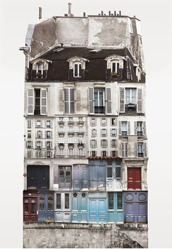
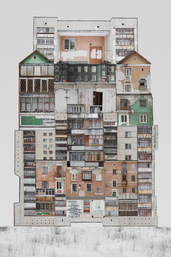
Anastasia Savinova
|
|
|
|
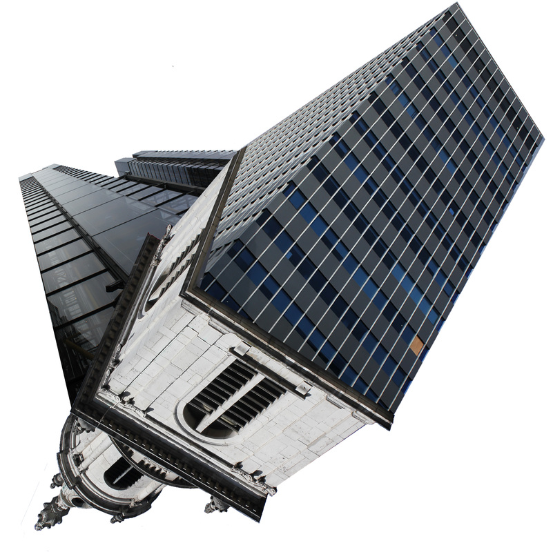
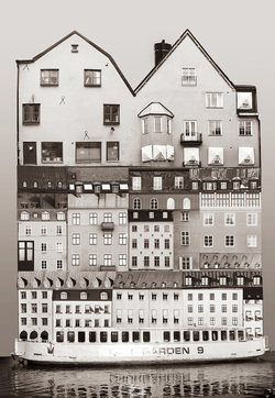
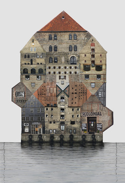
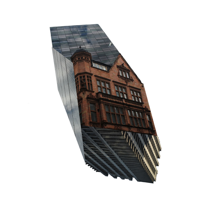
Anastasia Savinova is a Russian visual artist born in Sverdlovsk, USSR. Now based in Umeå, Sweden, she creates lots of different forms of art from photography to sculpture. In the pieces I'm looking at above she has collaged different images of the same styles of buildings in her local area to create these mammoth, impossible structures. She uses different scales of building within each image to create juxtaposition between the small and the large. This way of creating impossible situations is something I would like to look into more for the future of my project, I think this mixture of the real turning into the fantastical is something that's very effective in portraying the theme of Truth Fantasy and Fiction due to the way it makes the viewer have to look at the image for a while before they realise what's going on in the image, unlike images which you can skim your eye past without properly taking it in. Moving on from my previous work of putting two images of different buildings next to each other, I decided, after looking at the work of Savinova, to explore the possibility of editing the buildings themselves out of the images and fitting them together to create strange amalgamations of different buildings, carrying on the themes of both old and new, and the juxtaposition created by comparing different buildings.
Response
|
I travelled to the Bank/St. Pauls area of London with the intention of creating work in photoshop inspired by the work of Anastasia Savinova; creating impossible structures in impossible spaces. Taking the pictures I tried to get the most extreme angles as possible while still getting the whole building within the frame. This was because I was aiming to edit my images to create a similar fictitious building to those in Savinova's work but I wanted my images to have more of a 3-dimensional effect compared to her relatively flat images. For each of the buildings I edited out everything but anything from the frame that wasn't the building, after that I combined the cut outs of the buildings to create the images you can see below. Though I thought they looked effective I thought they didn't look realistic enough, considering. I think this was because the edges didn't fit together well enough and they didn't seem to form a single object in space like Savinova's buildings.
|
|
JUXTAPOSITION BETWEEN OLD AND NEW ==> CONTRAST OF OLD/NEW REAL/IMPOSSIBLE SPACE
Response 2
|
|
With my next shoot I went to Southwark with the intention of capturing more images to create another collage. Sadly the lighting on the day was a bit grey so the images didn't come out as I had hoped but after evaluating my previous response I think the images I got were better because pf the ways I framed the buildings. My favourite image of this shoot is the top left in the collage I created above, this is because I think the angle at which I shot it gives the image a really effective dynamism. Again I couldn't manage to fit the images perfectly together as you can see above though I think this collage looks much better than my previous piece. After creating the image you can see above I decided to create a 3-d model of it in an attempt to see if I could improve the effect it created of an object in a fictitious space, however upon creating it I thought that it didn't look as good as the flat image. This was because I thought the image itself already had the effect of appearing 3-d without actually being 3-d so I decided against using this technique for my later developments.
|
|
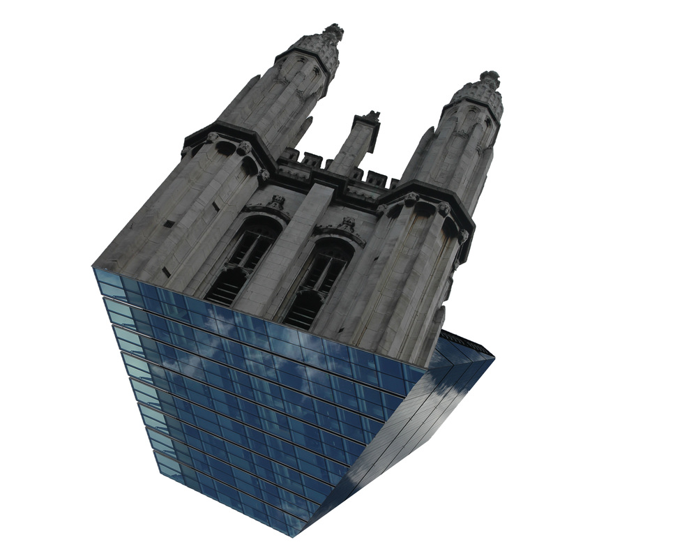
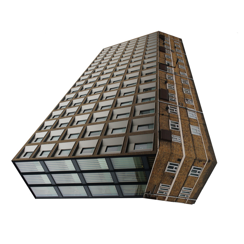
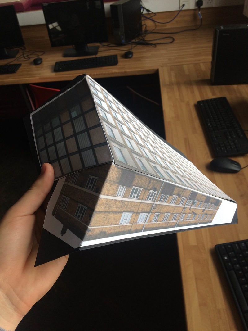
Final Piece - (Im)possible Structures
For my final piece I wanted to create several different pieces similar to those I had done before, however unlike before I wanted them to be much more convincing so that they looked like possible structures, in impossible spaces, therefore toying with the line between truth and fiction.

|

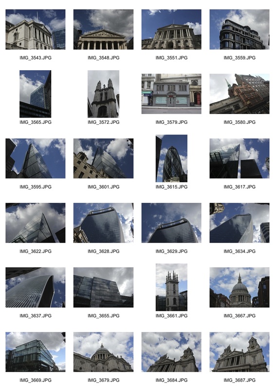
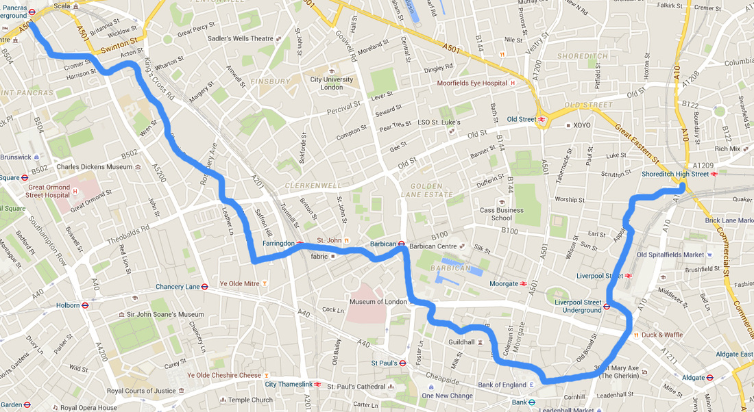
For my final shoot I travelled through Liverpool Street, Bank, and Hatton Garden, in an indirect route towards Kings Cross which I have shown roughly below. The weather was perfect for my images with blue skies and sun, meaning that the buildings were looking their best. One setback of this weather was because I was shooting from around 3-6pm, the sun was facing in one direction, so I had to walk around some buildings in order to get the side that wasn't shrouded in darkness.
|
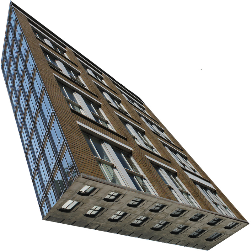
Here are the images I chose to edit and use in my final pieces, before and after the editing process. From my previous developments I knew that the best looking compositions were those made up of buildings with more linear shapes and sides so, with a couple of exceptions, I chose buildings with straight lines and square-ish shapes. This made editing the images much easier as I could erase in straight lines which game me clean shapes unlike some of the more nobbly buildings for which I found harder to edit out the irrelevant backgrounds.
Creating my final pieces I spent a long time trying to work out the best combinations of buildings that made the most convincing impossible structures. This involved placing 2-4 of the edited images together in photoshop and adjusting the scale of each building in order to create a relatively believable structure. This took longer than I expecting as I wanted to keep the shapes of the buildings which mean not distorting them when changing their scale, this was a problem as the angles created by the buildings being put together were ofter wrong so thats why sadly in some of the images the sides of the buildings don't fit together perfectly as I would have hoped. However though the images did not come out as perfectly as I imagined they would, I still believe they adequately portray the goal I set myself for my final piece which was; create several different pieces similar to those I had done before but unlike before I wanted them to be much more convincing so that they looked like possible structures, in impossible spaces, therefore toying with the line between truth and fiction.