Create a series of images that aim to represent the way in which capitalism affects, and is affected by the consumerist nature of our society.
On the weekend I decided to shoot all of my photos on an old point and shoot film camera. I first went to Canary Wharf with the aim of getting photographs of the people that work in that area. However when I went the streets were very quiet and there weren't many people that I thought went with my theme of capitalism as there weren't crowds of people in suits. So after failing to get any good photos in the city I decided to travel north to Brent Cross shopping centre where I decided to change my focus of the weekend from the people involved with capitalism to the places associated with capitalism, photographing the long promenades and the shopfronts, as well as the multi story car parks. Sadly while developing it in the dark room, the film was ruined. Due to this inconvenience I have decided that for my next shoot I will use only digital to make sure I actually get images from the shoot. Following on from last weeks shoot I have decided to use the images of Brian Ulrich as inspiration.
Brian Ulrich
|
|
|
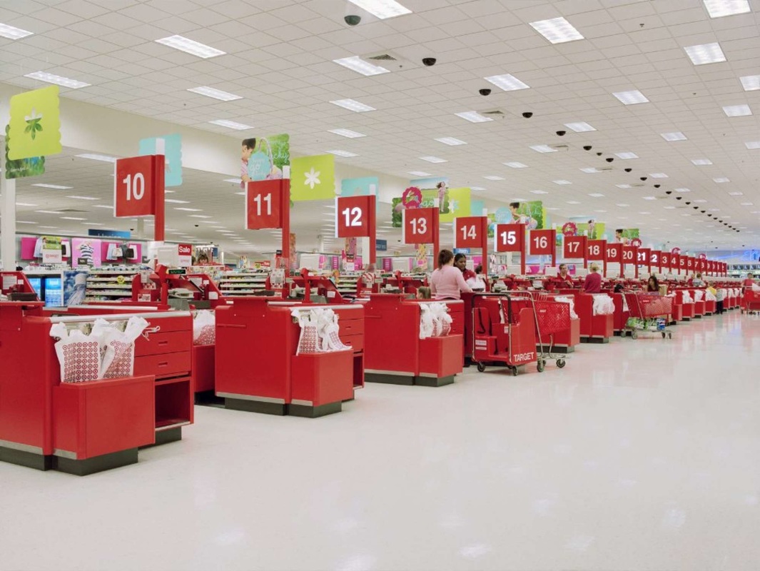
Ulrich is an American photographer who in his series' Retail and Dark Stores he goes to super markets and shopping 'malls' in the USA. He shoots all of his photos in colour and in every images there are vibrant colours which make the subjects stand out massively. This links in with my theme of Capitalism as retail parks and shopping centres are the perfect materialisation of the consumerist nature of the way in which we live our lives. In many of his photos Ulrich captures the positives mixed with the negatives, sometimes showing it as one person's positive which may be his negative, but he captures each of his images from a neutral standpoint. Using Ulrich as inspiration, for my next shoot I plan to go to my local retail park and capture images of the huge warehouses full of products.
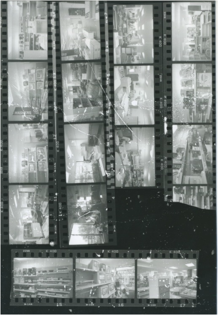
1st Response - Retail Park
|
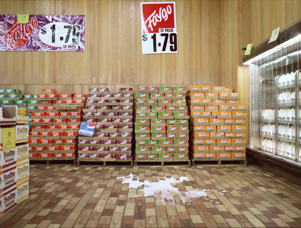
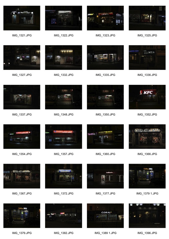
For my first successful practical response I went to my local retail park in Frien Barnet with the aim of taking pictures of the shops, inside and outside, to encapsulate this area which's sole purpose is to sell. The retail park itself is on the edge of the M25 and to get there without a car it involves a 15 minute walk along the side of the motorway. I would have preferred to have people in my images but when asking for permission to shoot inside the shops I was informed that no customers could be in the images. This made me focus more on the framing of my images. The shop in which I found my best shots was B&Q as they had things in much larger quantity than the other shops in the retail park, this meant that it was easier to get images with recurring features. After choosing my 24 favourite images from the shoot I created a contact sheet and from those images I chose 7 photos to edit in photoshop. With most all I did was adjust the brightness and contrast so that the key elements of each shot were highlighted. My favourite image of the 7 i chose to edit is the one of all the the price signs above the baskets as I believe it best represents the aim I set myself for the project and the shoot which was to represent the ways in which capitalism affects, and is affected by the consumerist nature of our society. I believe this photo goes with my project brief because the huge signs with just the price on them makes it seem like the price is more important than the product so they set it out so that you decide if you may want the product if the price catches your eye.
|
Brian Ulrich->Shopping Centers->Mass Retail->Retail Park->My Response
Victor Burgin

|

|

|
Victor Burgin is a British writer and artist who came to attention in the late 1960s while he was widely regarded as a political photographer as well as a conceptual artist. His work is influenced by the works of Karl Marx and Sigmund Freud among others. His most famous photography work is that in the style of his images above in which he fuses images with different symbols, mainly to make a statement against the nature of society. With his use of flat colour and contradictory images, symbols and text he creates collage-like images that each aim to examine the relationship between apparent and implicit meaning. For my next shoot I am aiming to capture the throwaway nature of our society to juxtapose my shoot last week by going to an electrical and furniture charity shop.
2nd Response - Charity Shop

|
|
For my second response I visited the British Heart Foundation Furniture & Electrical Store in North Finchley with the aim of capturing some of the elements of our throwaway nature that goes hand in hand with the consumerist nature of our society. I shot in both digital and film to get two different viewpoints of the shop. From my digital images I chose my favourites and edited them in photoshop. For my film images, using the contact sheet I chose 3 images I wanted to enlarge and print. Even though I made a test strip to work out the optimum time the paper was exposed to the enlarger, I would have preferred the photos to be darker as all the objects in frame aren't distinct from one another.
Victor Burgin->Contradiction->Low End Retail->Charity Shop
3rd Response - Recycling Centre

Looking back at my images I realised that my better images were those that I shot close up to the subjects so that you can see all that is happening. Carrying on from last weeks shoot I visited another place which highlights the consumerist and throwaway nature of our society, the recycling centre in Tottenham. Before the shoot I was planning on going to the recycling centre nearer to me in Hornsey but I was unsatisfied by the tidiness and emptiness of that centre. So I decided to go to the Tottenham Hale recycling centre which I found was much ore interesting and the stuff in the bins was much more varied. Unlike last time I chose to try and get close up to to what I was shooting so that it filled the entire frame. Compared to my last shoot I was looking at the things that cannot be sold on, as well as those damaged beyond repair. After choosing the best images I edited them in photoshop and decided to merge them together in order to have lots of things within one image, still with the close up feeling I like in the images, using Victor Burgin's collage style of photography as an inspiration. My favourite of the two images below is that of the appliances, this is because of the uniform colour of all the objects, white, and the way in which each of them is a different tone of white, depending on the amount of use they have had.
Mass Consumerism->Throwaway Culture->Recycling
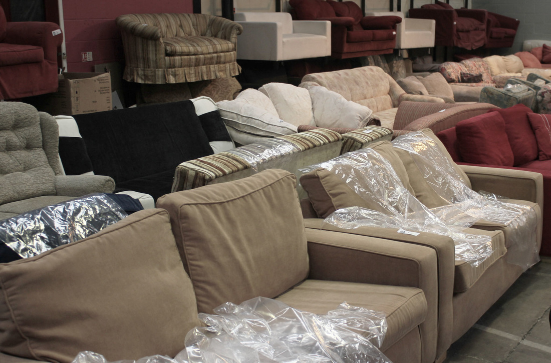
4th Response - Second Hand Furniture Store

For my next response I visited the ReStore used furniture shop in Hornsey. This is where, unlike the previous recycling centre, things that are not beyond repair are sold on, instead of thrown away. This is a different, less impactful kind of consumerism, yet still a form of retail. I chose some of the best images and decided to edit them in photoshop changing the contrast, brightness and saturation. By making the images more flat I believe it add a bit of age to them, and because the subject matter of the images is old and second-hand I think the way I edited the pictures matches the idea of "used".
|


|
Recycling->Resale->Consumerism Cycle
5th Response - Car Showroom
For my next response I visited the BMW dealership in East Finchley, carrying on my theme of retail. The car industry is worth £593billion globally, meaning that it is one of the biggest industries in the world, in the UK alone 2.5 million cars were bought in 2014, giving support to the idea that cars are almost the pinnacle of the consumerist idea. My aim for the shoot was to capture these luxury items while they're looking their best in order to show the highest ends of the retail spectrum contrasting to my shoot at the beginning of the project at the retail park. I tried to take pictures that would show the shine of the cars, something you associate with the idea of 'new'. Similarly to my previous response with the shop signs, light was very important when taking my images of the cars, I tried to get the light from the fluorescent bulbs over the curves of the cars in order to get the interesting shapes you can see in in the images below. Using contrast and brightness tools in photoshop I tried to make the lights more visible but at the same time trying to not make the images look over edited, I then put four of my favourite images together, in a similar style to my pictures from the recycling centre earlier on. I edited them together because I thought the different images with the different patterns brought together would create an almost abstract piece.

|
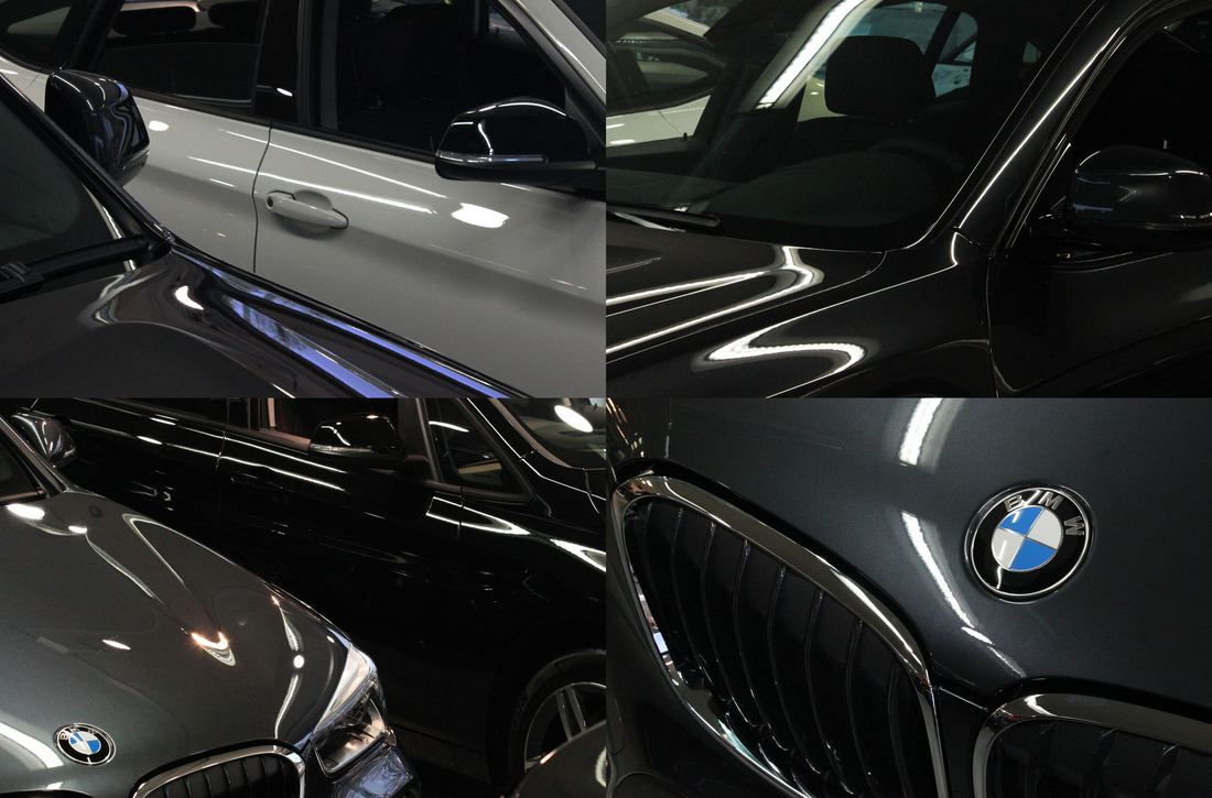
|
Jonathan Lewis
|
|
|
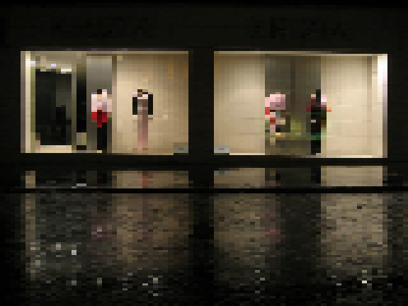
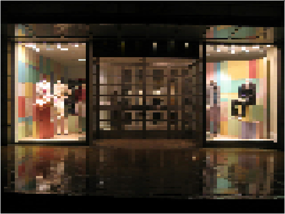
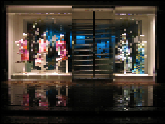
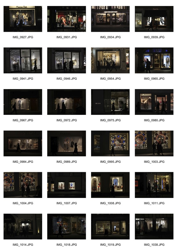
In his series 'Designer Labels' British artist Jonathan Lewis captures the illuminated shopfronts of different high end clothing shops and edits them so that the images are so pixelated that you only gain an idea of the general shapes and colours of the displays. This removes the label, as it were, of the shops, turning them all into similar blocks of colour. The fact that the images were taken in darkness allows the lighting of the displays to be as the shops wish it to be, as well as giving the images a much more striking look. Through the way he edits his images the artist brings an abstract element to each picture through the blocks of colour making up the shapes. This series relates to my brief through the statement it is making about the way in which most of our shopping depends on the brand and/or the shop, and by making each shop unrecognizable, Lewis takes away the value of the shops almost.
6th Response - Shop Signs

|
After looking at the work of Jonathan Lewis I decided to move my project's focus from the wastage and recycling of goods, back to the retail of the goods/services. I went into Central London around Covent Garden and Leicester Square with the initial intention of photographing shop fronts in the style of Jonathan Lewis. However due to the amount of pedestrians I found it very hard to capture the whole of the shop fronts, uninterrupted, in the way Lewis does. For that reason I decided to change my aim for the shoot from the whole shop fronts to just the signs of each shop. The logo of a shop/brand is one of the most important features, it is what people associate with a company's products, and if the company is popular enough, it is why people buy the products themselves. I decided to go in the evening due to the fact that I believe the shop displays, as well as the signs, look much better in the dark. Using a very low aperture I took the pictures with the aim of bringing out the lights used to illuminate the signs. After picking 6 images I edited each in photoshop, removing any features that drew attention away from the signs. After I had the signs on mainly black backgrounds I collaged similar images together in two separate images and using a black background I tried to create the feeling that the shop signs were shining out from the pitch black night to make them stand out more as well as making the signs appear more dramatic.
|
Jonathan Lewis->Shop Fronts->Shop Signs->Advertisement
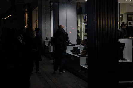
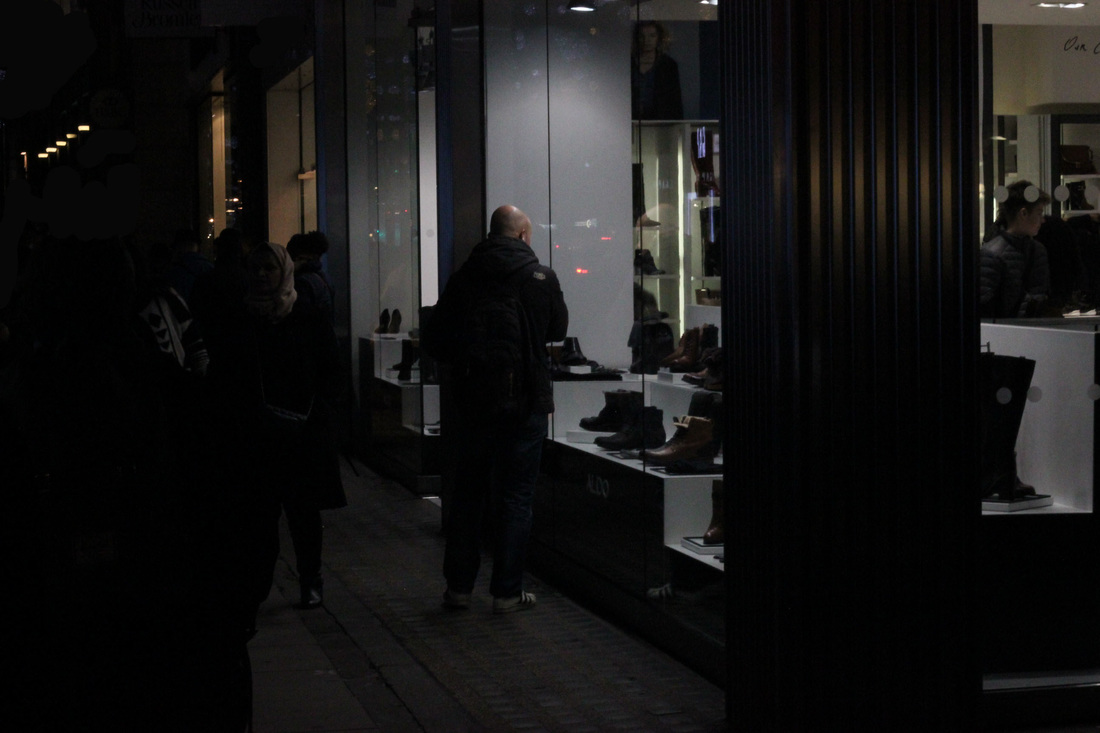
7th Response - Window Shoppers

|

|
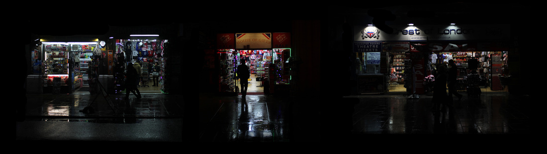
For my next set of images I travelled to Oxford Street which at this time of the year is starting to be crammed full of christmas decorations as well as new shop displays for the season. Similar to the shop signs I looked at in the previous response, window displays are extremely important in getting potential customers into shops and for as long as there has been window displays there has been 'window shoppers', those who survey the contents of the shops through the front window. I decided to look at this for my shoot and walking up and down arguably the largest shopping location in England I found a lot of people partaking in this activity of window shopping. The images worked best when the displays were particularly bright so that their front halves were lit and everything else was in darkness, paired with a high aperture I found this lighting very effective in achieving the images I was aiming for. In photoshop I used the brush tool to remove any features that drew attention away from the subjects of the images.

|
Andrew Curtis
While looking over my images I was reminded of work by the photographer Andrew Curtis who used the light from peoples mobile phones to illuminate their faces. This relates to mine through the way we both use unconventional lighting. to draw attention to our subjects, though his is more of a directed light source.
|


8th Response - Shop Fronts
|
For my next set of observations I returned to Oxford street, looking again at the use of shop signs as backing light, in a similar style to Jonathan Lewis (see 5th response). This time instead of using the people looking in the shops as the subjects of the images, I used the shop windows as a guide to frame my images. With these frames of light I tried to capture the silhouettes of the pedestrians walking past against the bright lights of the shop displays. Unlike my previous response there is less of an obvious interaction between the two subjects, the shops and the people. This interaction is what I am trying to capture in my images, that between the shops and the people that creates this idea of consumerism. I edited the images in photoshop, for some photos it was just a case of cropping out irrelevant parts and for most I had to tweak the brightness and contrast to make the silhouettes more apparent.
|

|
Peter van Agtmael
Peter van Agtmael is a Dutch-American photographer who after graduating from Yale University in 2003, travelled to the middle east, interested on the effect the 9/11 wars were having on the region. Here is an image from his trip to Israel and Palestine in 2013. In the picture he uses light in order to highlight the different features of the image. This use of different types of light gives the feeling as though there are two separate images within the frame, the bright fluorescent light of the shop on the left compared to the sparse, orange light of the street lamps on the right. The artist also uses the darkness surrounding the image to create a contrast between the dark and light, therefore making the details of the image stand out more. This use of darkness around the focal point of the image is something that I am interested in trying to imitate as I think it's very effective in the overall impact of the image.
9th Response - Silhouettes
|
After the success of my two trips to Oxford Street I traveled to New Bond Street, the home of luxury fashion in London. Carrying on from my images from my previous shoot and inspired by the work of photographer Alex Webb I went on this trip with the aim to capture silhouettes of pedestrians against the window displays of shops. Last time I found that most of my images had out of focus silhouettes in them so this time I used a faster shutter speed in order to get a crisper outline. Due to it being dark I had to make sure that I got the perfect shutter speed, too slow and the people would be blurred, too fast and the images would be too dark.
Alex Webb
This image by Magnum photographer Alex Webb inspired me for this set of images. The way in which he uses the light from the shop to create a silhouette of the man gave me an idea as to what to do with this set of images.
|
Shop Fronts->Window Shoppers->Shop/Consumer Relationship
Barnaby Barford
|
|
|
In his piece "The Tower of Babel", artist Barnaby Barford created bone china replicas of 3000 unique shops from every corner of London. He displayed these shops in a six meter high tower with London's derelict shops at the base and the boutique shops and galleries at the pinnacle. Barford cycled around 1000 miles to each of London's postcodes taking images of a variety of shops to be placed at different points within the tower. The tower was created in order to visualize Britain's obsession with shopping and was arranged as a tower to "playfully liken our efforts to find fulfillment through retail with the biblical Tower of Babel’s attempt to reach heaven". I am going to use Barford's "Tower of Babel" as inspiration for my final piece as I like the way in which he has made it seem as though all of the shops are all on one strange, packed street.
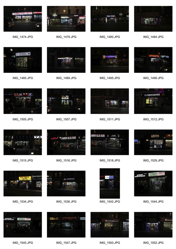
10th Response - Newsagents
|
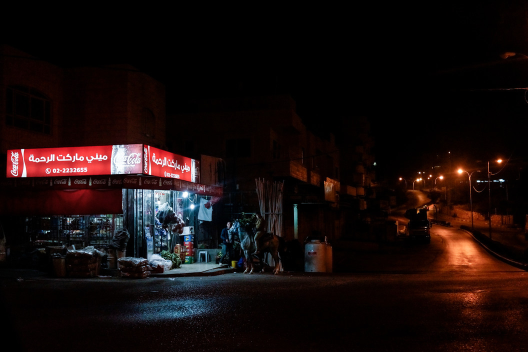
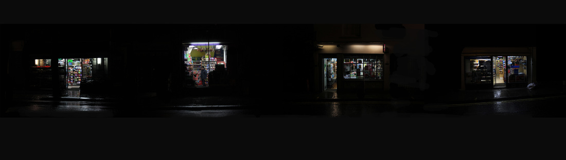
Newsagents, off licences, convenience stores, whatever you prefer to call them they are arguably at the bottom of the retail spectrum. There are over 50,000 of these shops in the UK and its hard to walk down a street in London without seeing one. Looking at the image by Peter van Agtmael reminded me of the work I did with shop signs in my 5th response in which my images had a similar style to Agtmael's in that the subjects were surrounded by darkness making them stand out more. I walked round my local area to different newsagents and using the darkness of the night paired with the bright lights of the shops I tried to capture the shops in a similar style to my previous images of window displays. After choosing my four favourite images from the shoot I edited them in photoshop, firstly to increase the contrast and then to compile the images together in one long strip, to give the impression of a dark street with these four shops on in a similar style to Barnaby Barford.
|

|
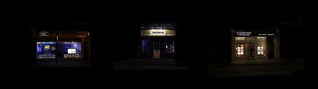
11th Response - Estate Agents
|
For my next set of images I cycled around my local area taking pictures of different estate agents. Estate agents are a strange class of retail as even though they participate in millions of pounds worth of sales they are very a frequent feature on Britain's high streets. I didn't find this shoot very fruitful as the displays were not as bright as those in central London.
|
Gilles Coulon


Born in 1966 in Nogent-sur-Marne, France, Gilles Coulon started his career as a photographic journalist for the French daily newspaper Libération. The images above are from his series White Night in which he traveled to ckities all over the world from Shanghai to New York, in each image he uses the fluorescent tube light as the focus and only light source. He says that he thinks the images "invite us to imagine the atmosphere of these cities and of each spot lit place". I can draw many similarities between his and my work as we are both using the way in which the lights of shops and buildings are enhanced by the darkness of night. Here I have placed one of Gilles Coulon's images next to one of my own to show the ways in which I have drawn inspiration from his work.
Artist and me


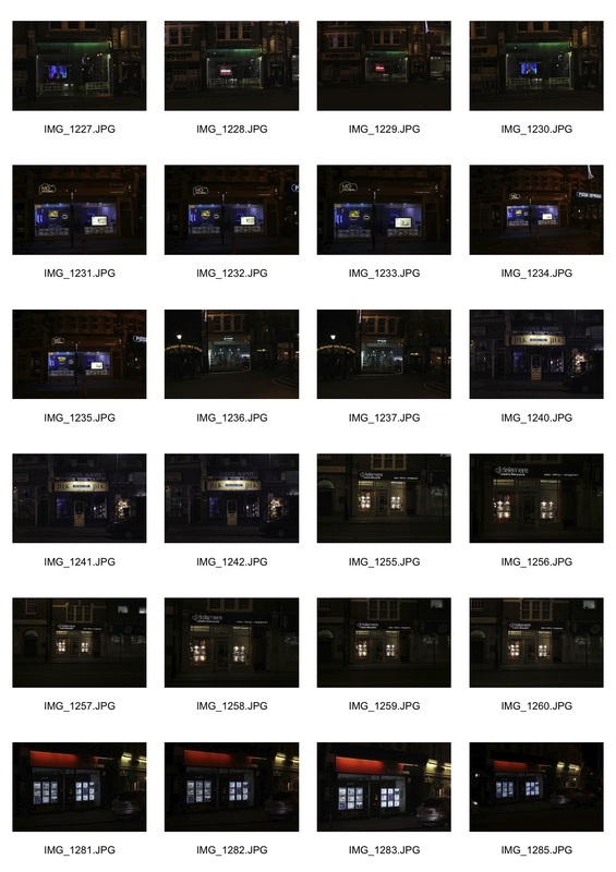
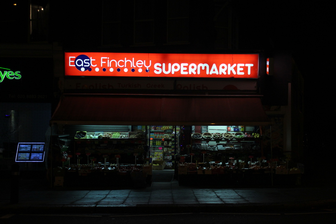
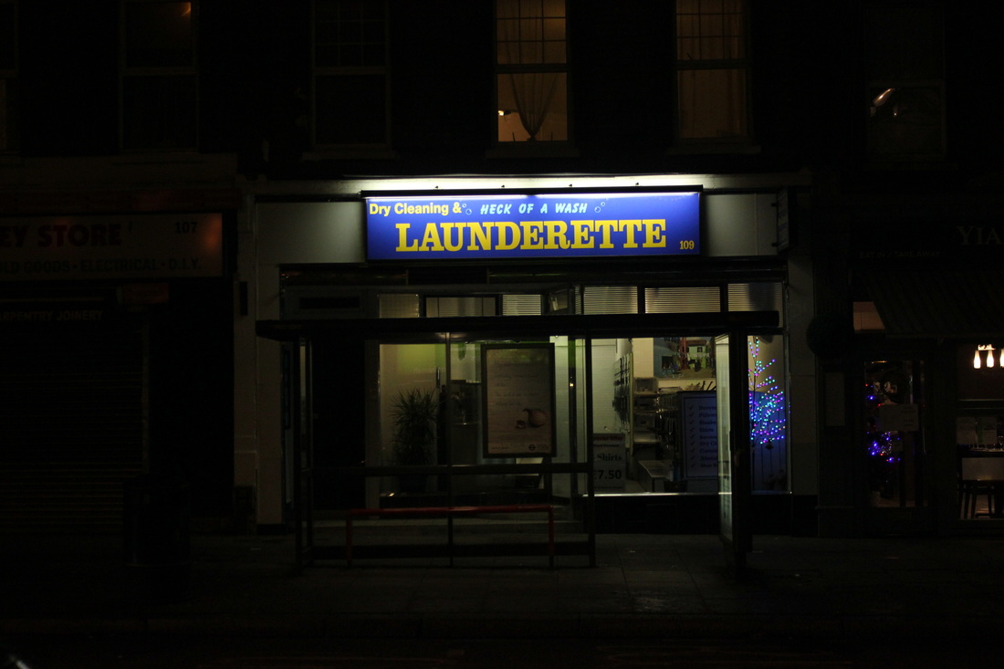
12th Response - East Finchley
I decided to move on from doing each shoot based around one type of shop and went out this week to East Finchley and took photos of as many shops as possible, sorting them all out and compiling them when I have enough images to make one similar to the ones above. I think the images from this shoot came out really well with my particular favourites below. As you can see the lighting of the shops was very good due to my use of aperture and shutter speed which allow the normally harsh lighting creates by fluorescent lights to be much softer as well as lighting up the different shop displays quite dramatically in my opinion. I think the image of "East Finchley Supermarket" shares many similarities to the work of Gilles Coulon which you can see above.
|
|
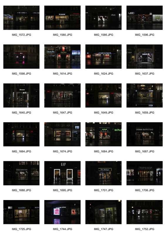
13th Response - Exeter
|
Continuing to gather content for my eventual final piece in a style similar to Barnaby Barford influenced by the work of Gilles Coulon, I travelled to Exeter in Devon. The centre of Exeter has gone through a huge transformation in the past 15 years with huge department stores opening as well as lots of new malls and parades full of the same shops you see on all of the high streets of England. Compared to the rest of Exeter the newly rejuvenated centre is a huge contrast to the less desirable areas on the suburbs. Unlike my work in London I didn't have to deal with crowds walking in front of my shots which made it a much easier location to shoot at compared to places like Oxford Street. I think the images came out relatively well as I had worked out the perfect settings on my camera to get the right amount of light from the shopfronts
|
14th Response - Green Lanes
|
For my next project development I traveled to Green Lanes in Haringey which is a much more culturally diverse area compared to the places I visited previously. I found that the shops on the street were much more different to the ones in East Finchley and Muswell Hill for example. There were much more fast food and kebab shops compared to the restaurants and supermarkets that fill up the high streets of the other places I visited. Here I found it more lively than East Finchley and Muswell Hill which I believe helped my shots as there were more shops open with their lights on. Throughout this shoot I also tweaked with my aperture and shutter speed as some of my images were coming out too dark but I think I found the right combination in some pictures, though others look less good.
|
|
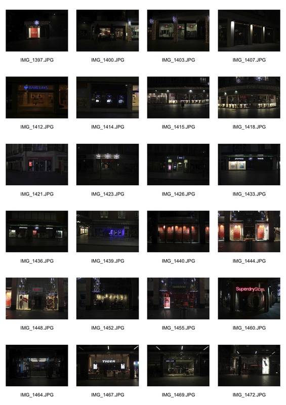
15th Response - Oxford Street
|
For my final shoot I went to Oxford Street in Central London, Europe's busiest shopping street attracting half a million daily visitors, with such a high concentration of people and retail it is obviously an epicentre of the capitalist machine. With so many potential customers passing by, shops have to use their front window displays to great effect in order to attract people in, some of which may buy something. Because of this abundance of exciting displays this made it perfect for my shoot which I thought was very successful. The enormous width of the street itself allowed me to walk opposite from the shops I wanted to photograph and get the whole shop within the frame, including some of the huge clothes shops as you can see below.
|
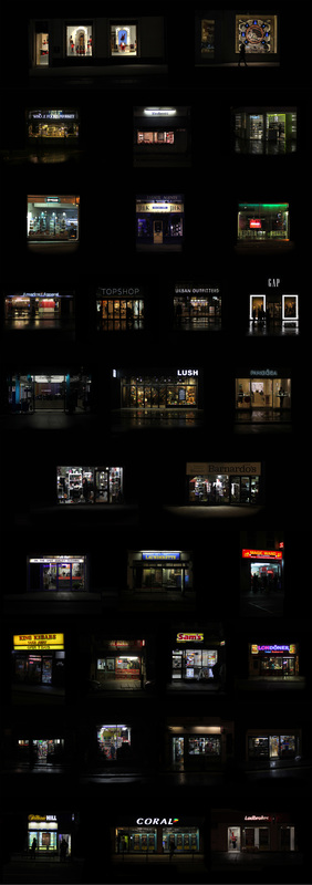
Final Piece
For my final piece I wanted to create a piece similar to Barnaby Barford's Tower Of Babel, documenting the different shops of London in order to show the variance between shops in England which contribute to the consumerist society in which we live.
Making the collages
Here is how I edited the shops into the strip shape I desired which would allow me to stack the strips together and create my final piece. I had to use the black paint tool in order to remove any irrelevant features from the images which in turn made the shops stand out more so that they became the sole purpose of each image.
Once I had all of my collages ready I put them together in the order in which I thought they should be creating one large strip similar to Barnaby Barfords Tower of Babel in the way that it shows my interpretation of the hierarchy of the different retail outlets in London. At the top I have put the boutique shops such as Louis Vuitton and Prada, below I put the fancier food outlets like Whole Foods Market, then estate agents, clothing shops, accessories, charity shops, launderettes, fast food shops, corner-shops, and finally, bookmakers.
|
|
I had originally planned to display the piece as you can see it above in one large piece, however I thought about the fact that it was only my opinion of the order of the shops. I decided to cut the image into the original strips and let the people viewing the image decide on their own order. I think this will help me to see how varied peoples opinions are on the shops of London and perhaps it would give me an insight into the consumerist nature of the country affects people. I used magnets to make it so that it was easy for the audience to interact with the piece
