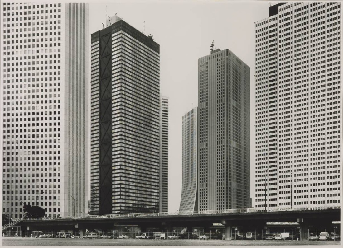
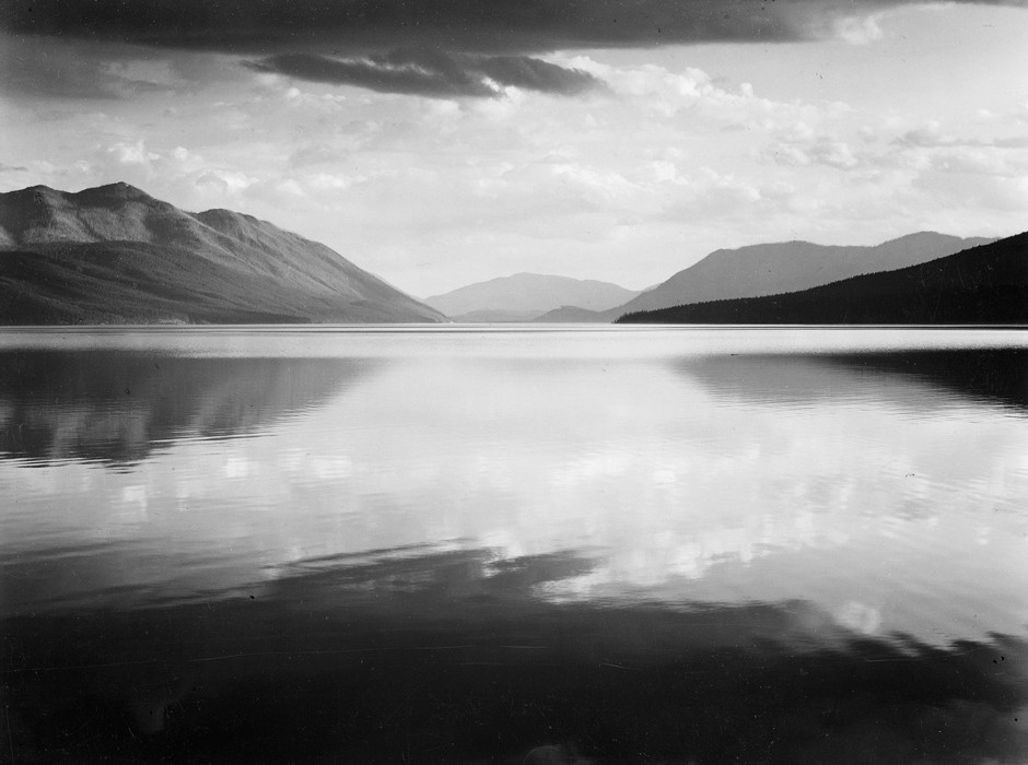
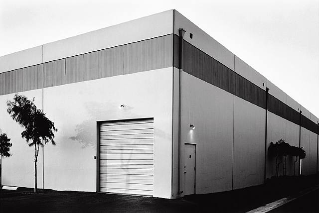
Above I have posted three images by three different artists who I believe are very good at capturing environments. The first image, by Thomas Struth, shows the skyscrapers of Tokyo in the 1980s, I think it is a very effective image due to the fact that it perfectly fits the buildings in the frame of the photograph, using the horizontal and vertical lines created by the buildings' windows giving the image a good pattern, as well as this the photographer frames the cars at the bottom of the image to show the sheer scale of the buildings linking to his thoughts of the growing strength of Japan economically. The second image by the famous American photographer Ansel Adams is of a lake in Glacier National Park, I think this is a hugely effective photograph in portraying environment due to the simplicity of it, using the colossal but vague shapes of the mountains, clouds and the lake to show the natural environment's impact which is very well captured in this image, showing how immense yet subtle the mountains are. The final image by Lewis Baltz is more of an intimate view of environment compared to the other photographs showing a very simple scene. I believe this image is great through the way Baltz uses simplicity to his advantage creating a good representation of the environment through the basic shapes of the building and the garage door contrasted with the complicated silhouette of the plants to the left of the image.
NADAV KANDER
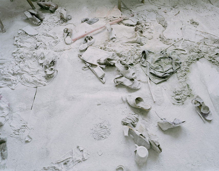
In Nadav Kander's series Half-Life he intended to show the uncomfortable nature of man's effect on the world. He did this by showing once human possessions in the shape of shoes, covered in dust. He wanted us to think about how the lives of whoever's shoes they were was so dramatically changed so that they had to leave them behind. Kander is considering the beauty of mankind's imprint on the world. This is shown by the way the shoes are covered by an untouched layer of dust. He wanted to explore the way in which mankind can have something so essential then leave it due to their effect on the world. Kander used a film camera in creating this work. This creates a strong compositional quality in his work. This helps to support his like of the uncomfortableness in his photos due to the fact that when taking a photo with a film camera he takes time thinking of the compositional elements in his photos rather than a digital camera.
formal elements
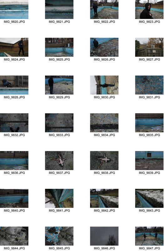
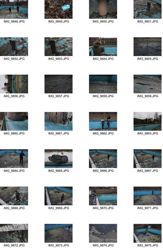
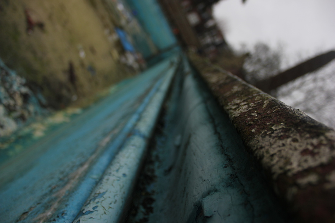
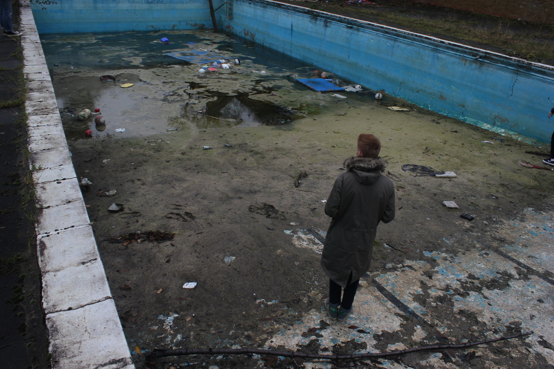
We went to the swimming pool in the school to photograph it with the formal elements of photography in mind, these include; scale, perspective, texture, focus and negative space. Here are the images I took based on the formal elements.
|
|

|
Below are the most striking images I took in this set due to the contrast and how the details and aspects of the formal element stand out from the image. I will select two to edit in photoshop.
Perspective
Pattern
Focus
Scale
Negative Space
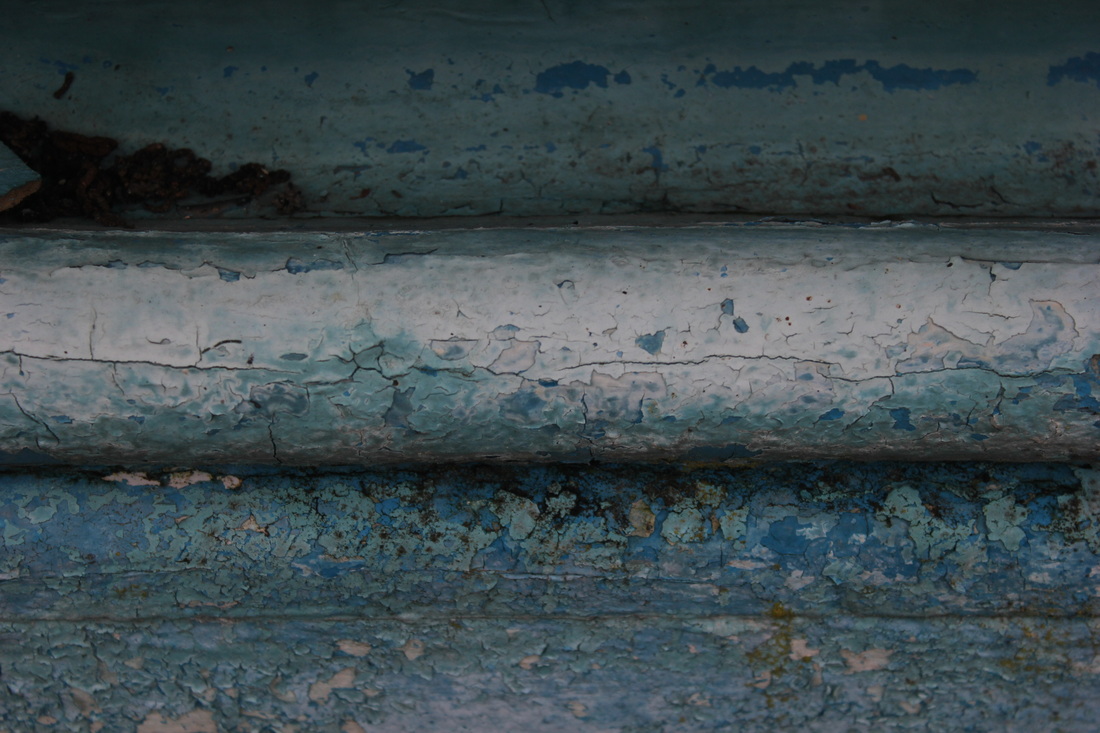
Texture
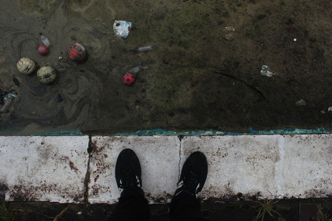
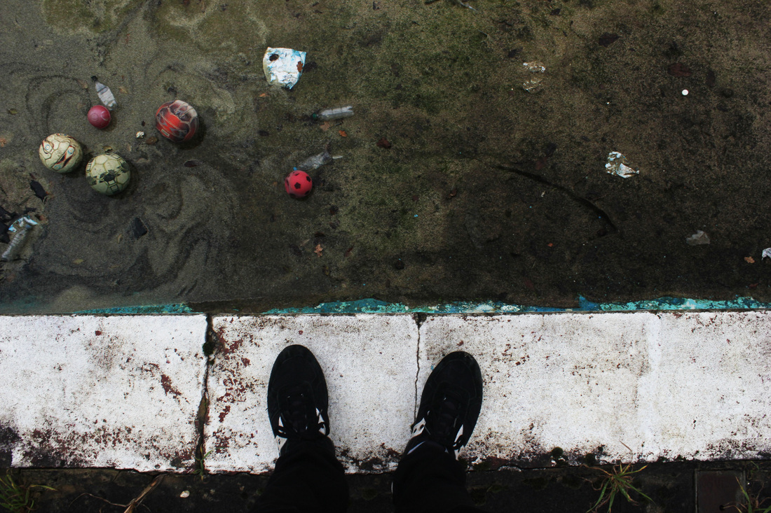
These two images are my favourite photos from the day which I have decided to edit in photoshop. Because I believe they are already good images, I will only slightly change the contrast and brightness of the image to make them as strong as possible. The reason I like these tow images is because how the colours work together, for example in the first image, the colour of the coat and that of the algae are very similar. I the second image I like how the change in levels is hard to see yet by having the shoes at the bottom of the image gives an element of perspective.

Strand continuation
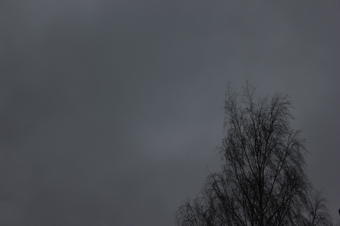
After my series of the swimming pool I travelled to the South Bank in central London to take photos relating to the topic of Walkways.
|
|
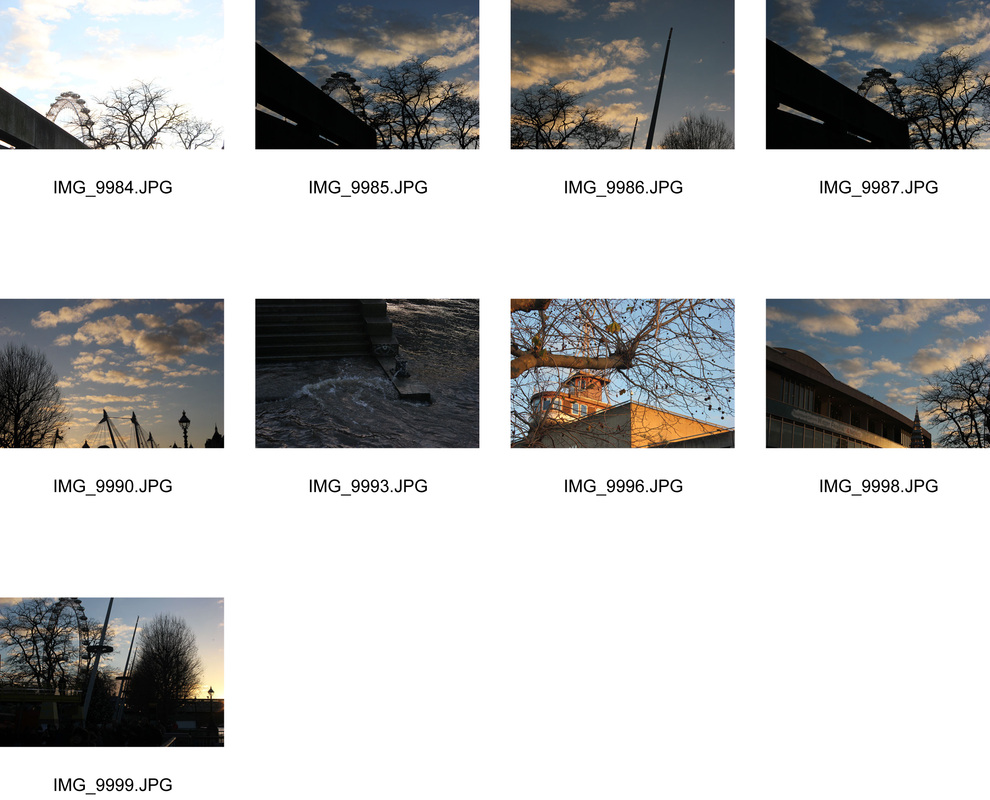
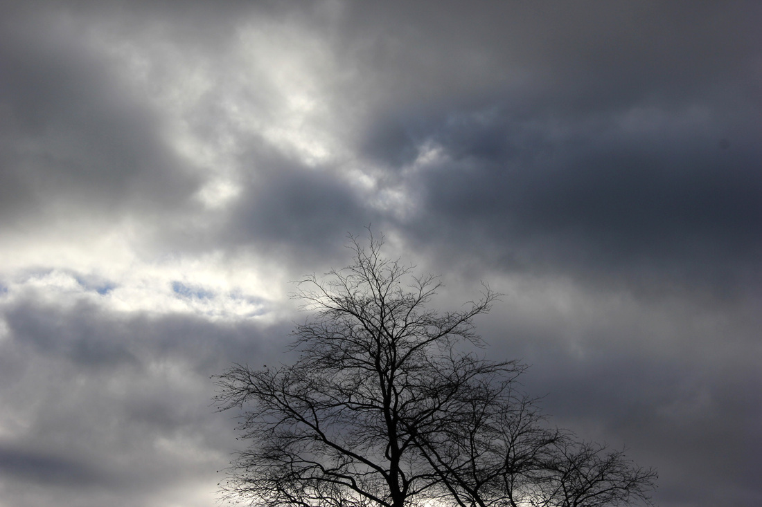
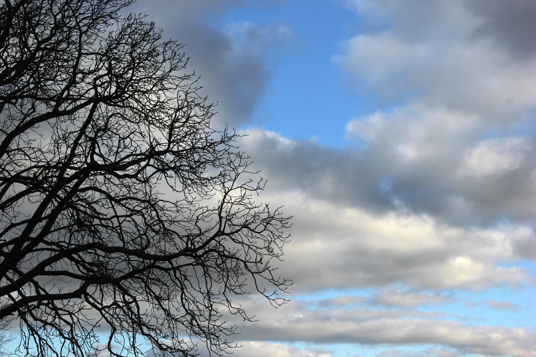
After some time taking pictures of the walkways I realised that, looking at the buildings above me, a better strand to follow would be the contrast between man and nature, this was effective due to how the trees looked silhouetted against the buildings and the sky. I spent some time changing the shutter speed and aperture to get the right combination of brightness and contrast.
|
|
I wanted to show the contrast between the sky, buildings, and trees to accentuate the contrast between man and nature, one thing that didn't come out as I hopes was the fact that in some of the images the silhouettes of the trees and building mixed together making them indistinguishable in some shots. The fact that the sun was setting at the time I was taking the images allowed the contrast between the trees, structures, and sky to be greater therefore creating a better effect.
Rule of thirds
The rule of thirds is a guideline which helps you compose photographs. It is made by putting two horizontal and two vertical lines across the screen splitting it into 9 equal portions. If you place the subject of the image on one or two of these lines the image has much more of a pleasing effect and brings the elements in the composition of the image together. I took some images to demonstrate the rule of thirds.
|
|
Here I have selected three photos showing the way they respect the rule of thirds.
Texture
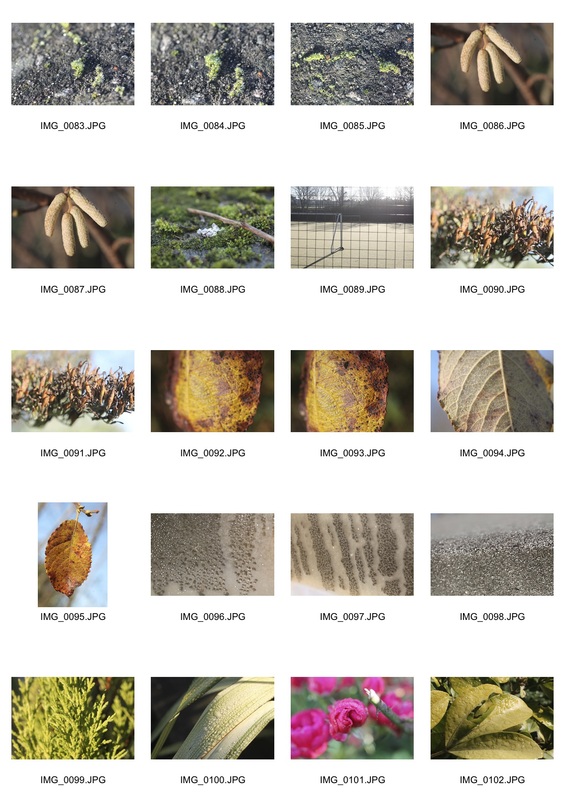
In my latest set of images I went to an allotment with a macro lens to look at some natural textures up close as well as incorporating the overall theme of environment into the pictures.
|

|
Here are my 5 favourite images, which I edited in photoshop to accentuate the different textures in them. By changing the contrast and brightness of each image I believed I increased the feeling of texture in the pictures which was already there due to how close up I was able to get to the plants with the macro lens.
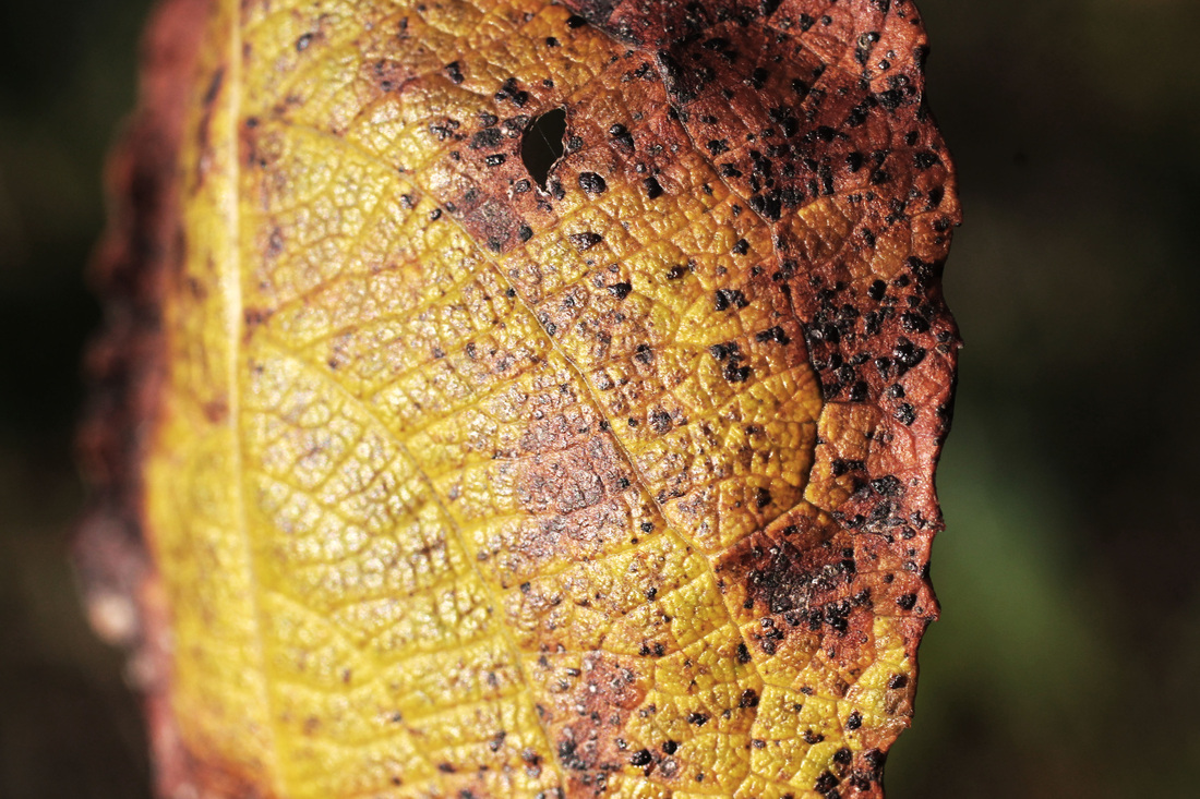
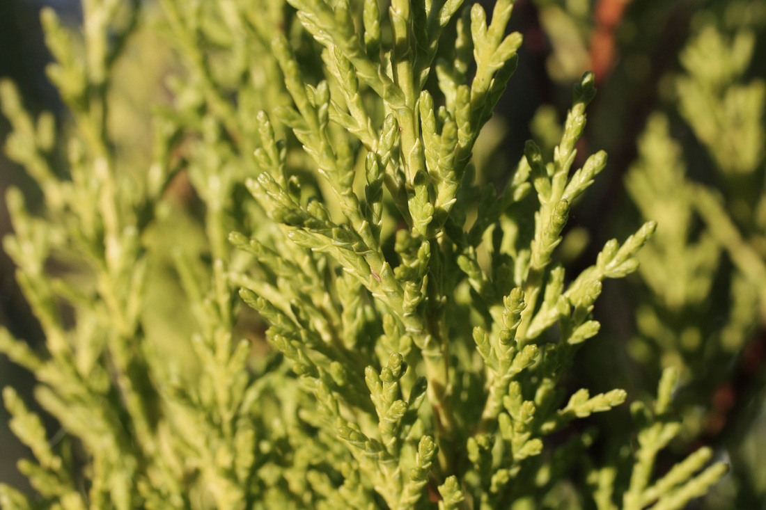

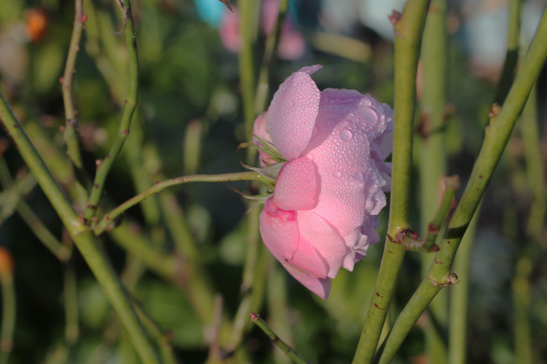

Another way in which the closeness achievable with the macro lens adds to the image is the fact that it adds an element of abstraction to the images, for example in this last image the tilt shift effect of only focusing only on the middle ground of the image makes it look like it could be on a much greater scale than it seems.
STrand continuation
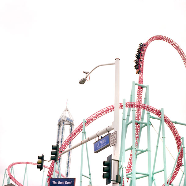
corina gamma
|
|
|
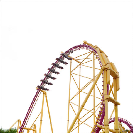
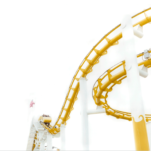
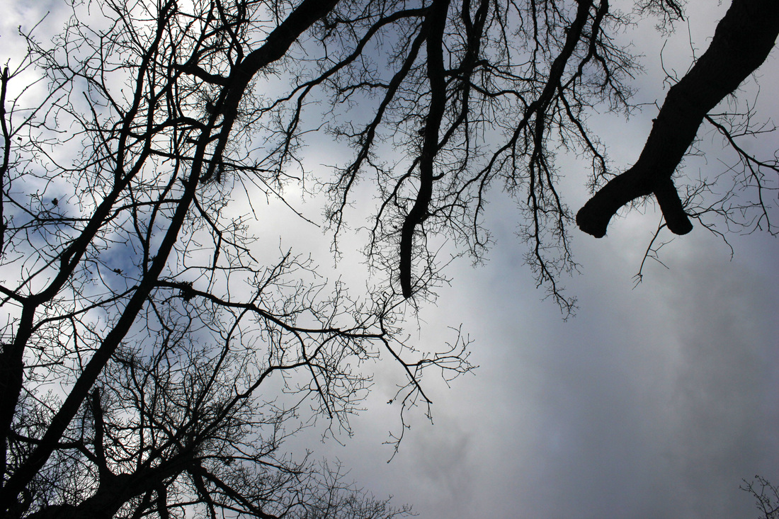
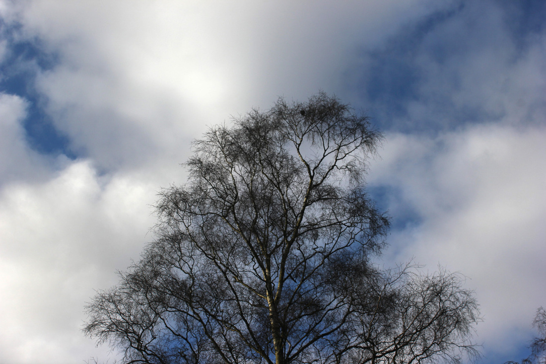
Corina gamma is an artist who explores the theme of negative space which is one I am interested in developing, linking back to my man and nature images I took recently. Though all of her images are of roller-coasters I think the style would still be effective using the skeletal like structure of the bare trees this time of year which create great silhouettes. My next set of observations will be based on the work of Corina Gamma through her use of negative space, as well as linking in with my man vs nature work previously.
negative space Continued
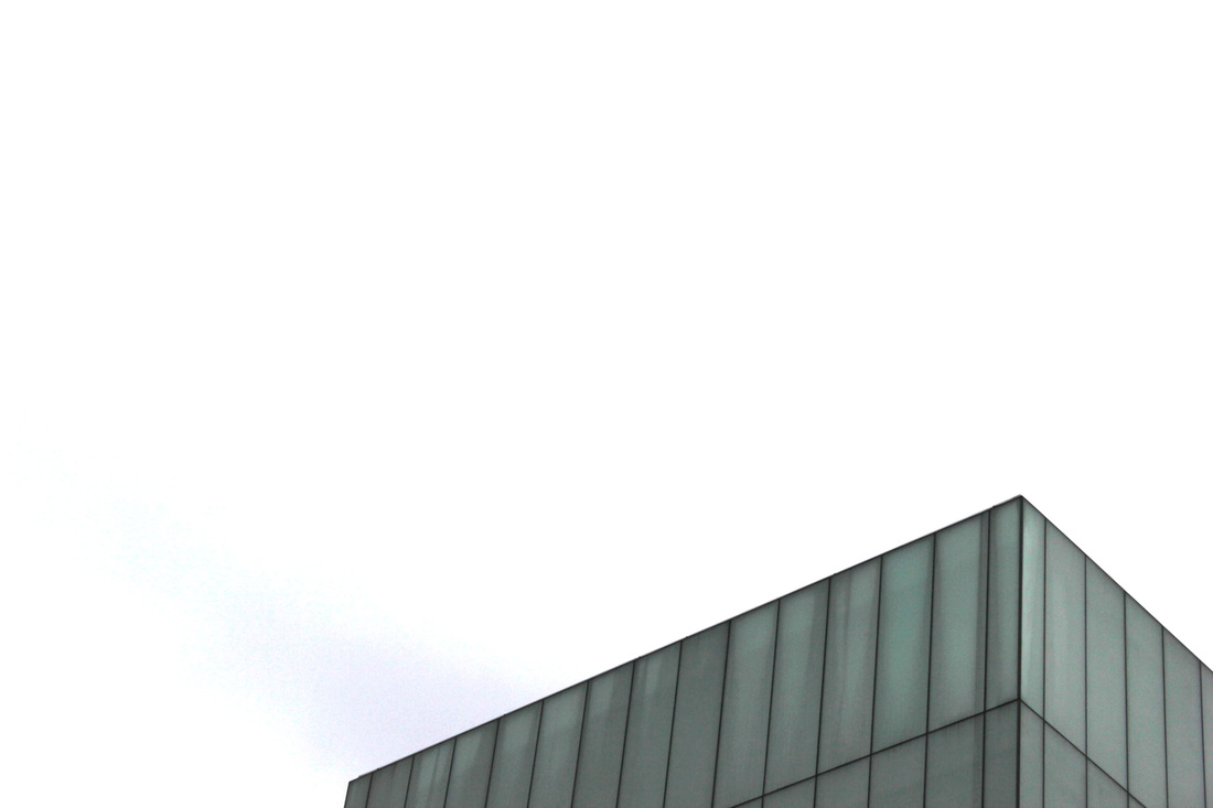
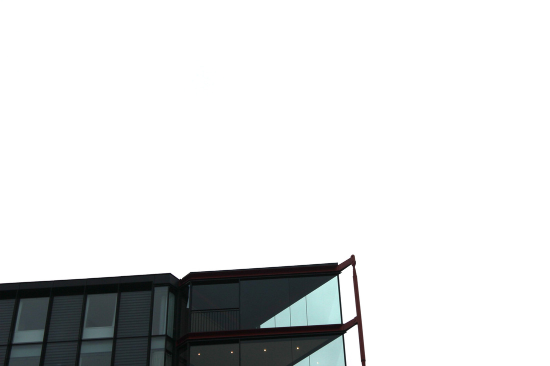
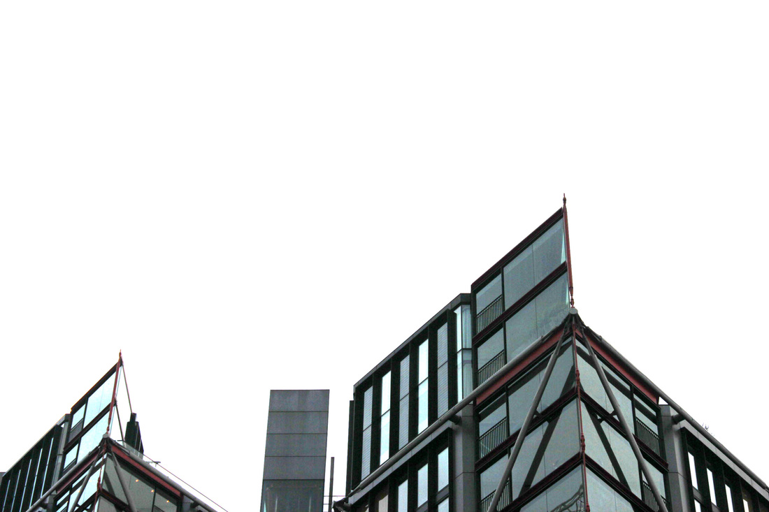
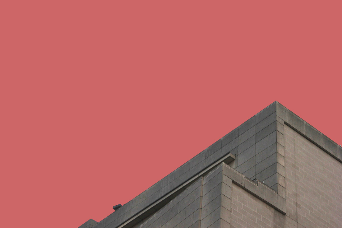
In my first set of observations following on from the theme of negative space I explored this style of photography by capturing the tops of buildings and the contrast they have with the sky behind them. This makes it so that the building is the only focal point of the image, with no background to distract the viewer.
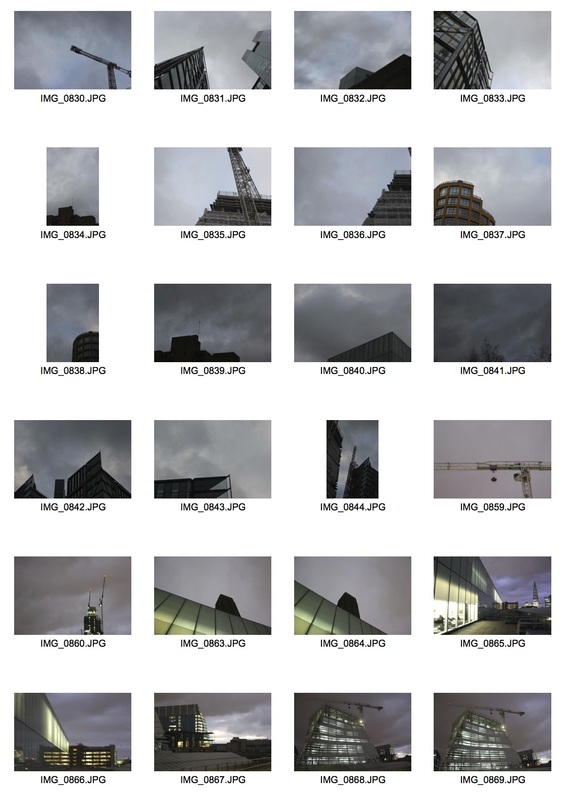
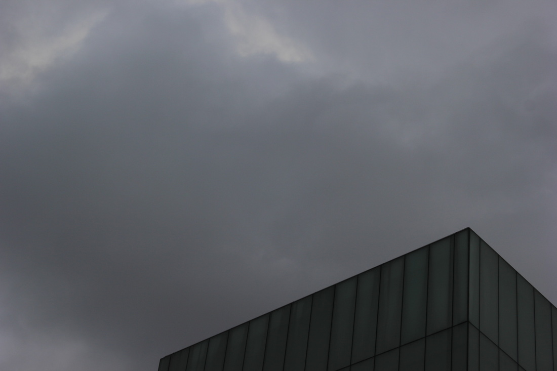
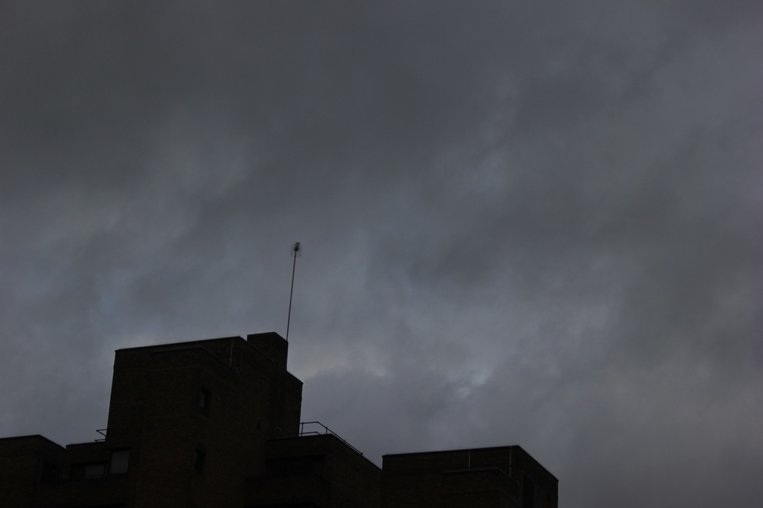
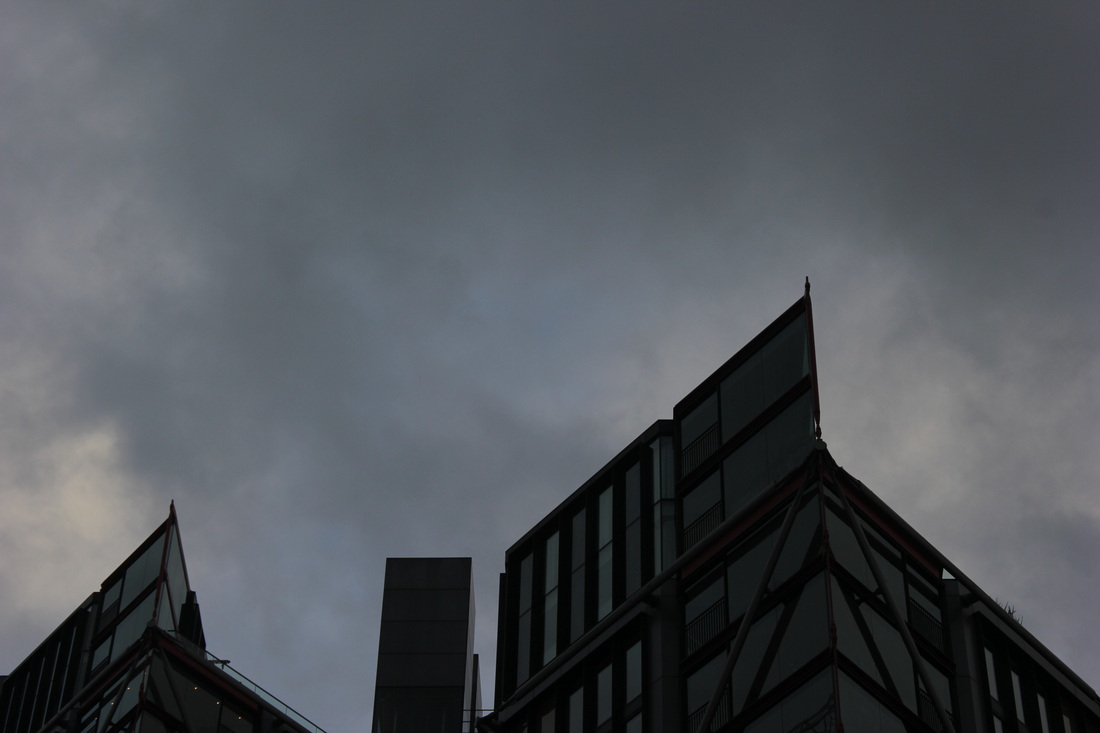
Looking at these images I don't like how the sky is so dark so I went into photoshop and adjusted the levels so that the images are more similar to Corina Gamma's photos.
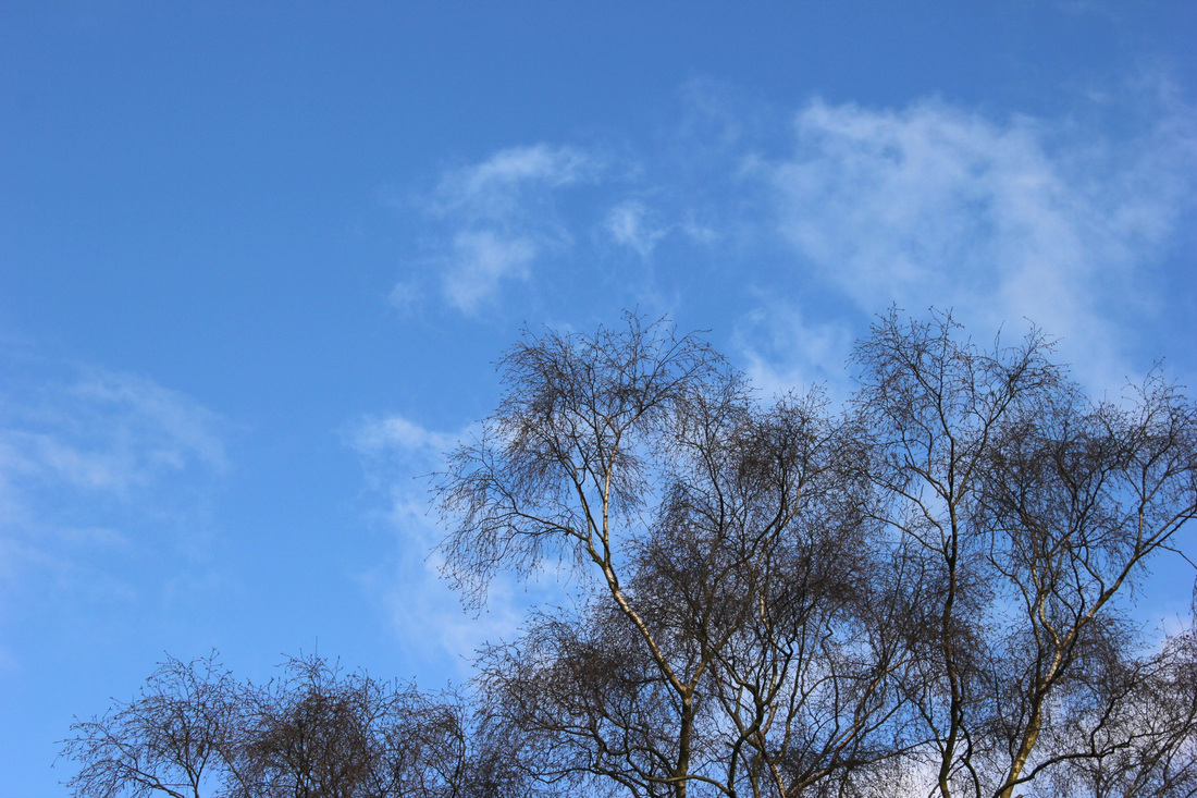
Strand development
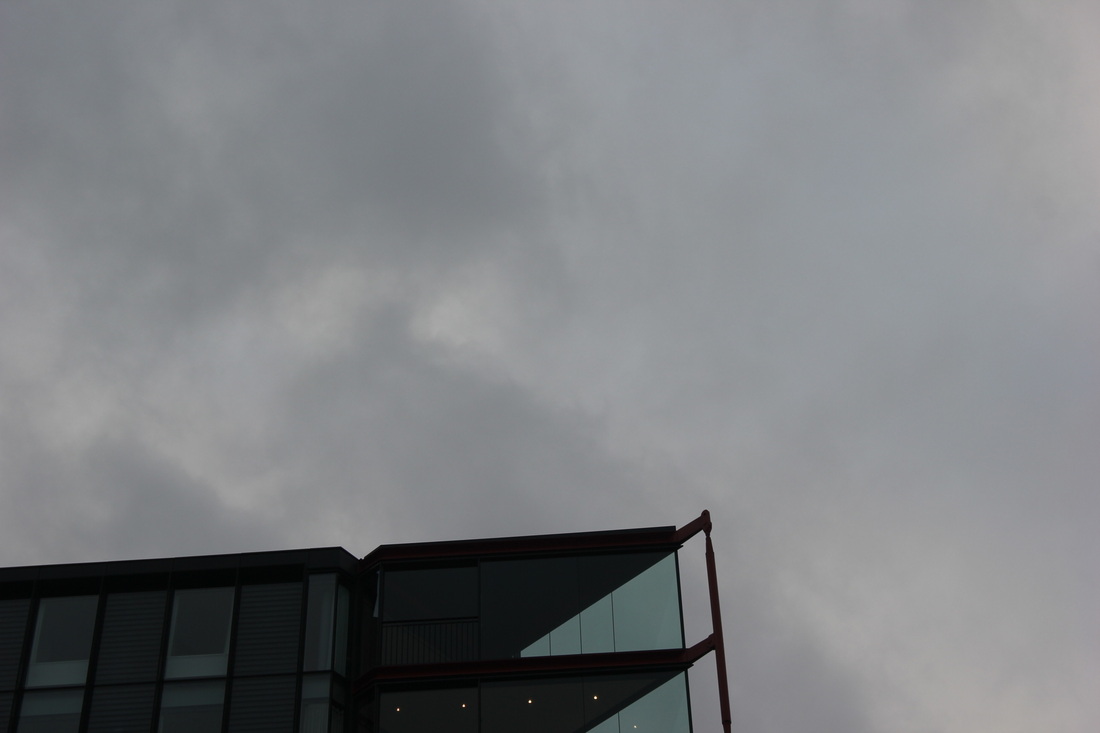
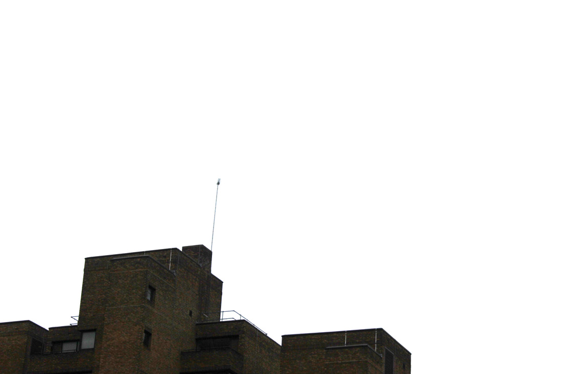
Unlike my previous set, this next set was shot on a sunny day meaning that I couldn't edit the sky in them to pure white but I think the blue sky contrasted with the silhouettes of the trees.
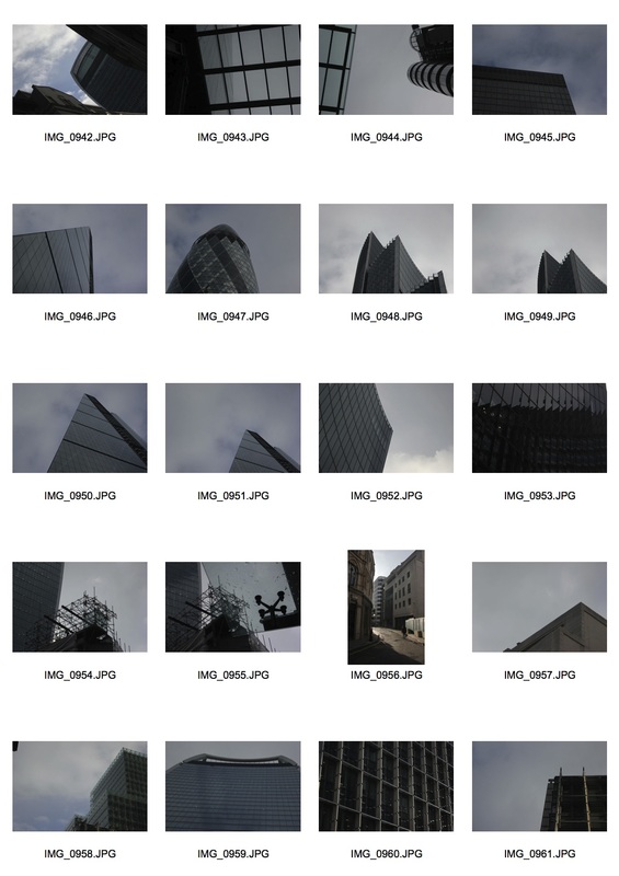
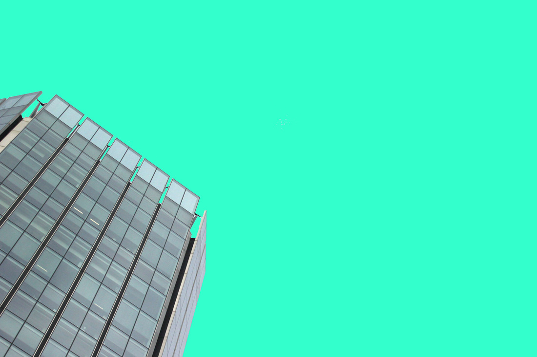
Linking in with my previous work I went into London between Bank and Liverpool St Station and took photographs of the buildings there using a low f stop to make sure the sky was light enough.
|
|
After choosing my favourite photos I put them into photoshop and changed the levels to make the sky as white as possible to make the images easier for me to work with later.
final piece...
Ed Ruscha

|

|
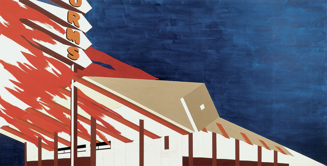
An artist who treats negative space in a different way is Ed Ruscha who uses acrylic paint to colour in the space. By doing this he makes not the only the building but the sky the focus of the image, what he also does is adds an unnatural colour to the sky to make it stand out even more, mirroring the colours he uses to paint the buildings. Though he uses the medium of paint for his pieces I think this style will be equally effective using images in photoshop.
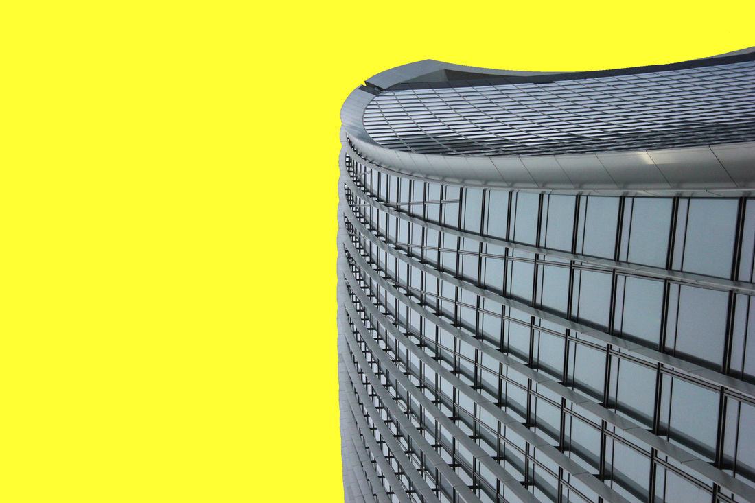
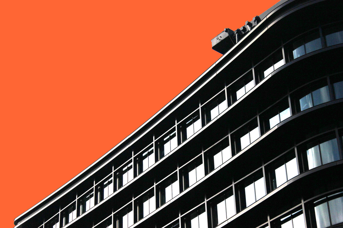
For my final piece I have decided to highlight the negative space in my images in a similar way to Ed Ruscha by selecting the negative space in the images and filling them with different colours in photoshop. Here I will show you how I edit my images in photoshop:
Here are the the 7 photos which I have edited using the above method to highlight the negative space.
I have chosen the colours to use as my backgrounds because I believe they are very bold and make the buildings stand out, especially the more luminous ones like the yellow and orange.

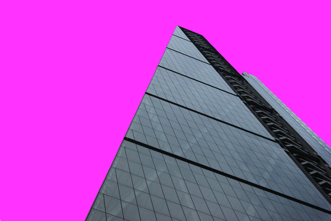
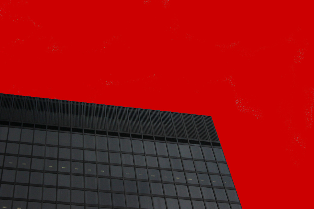
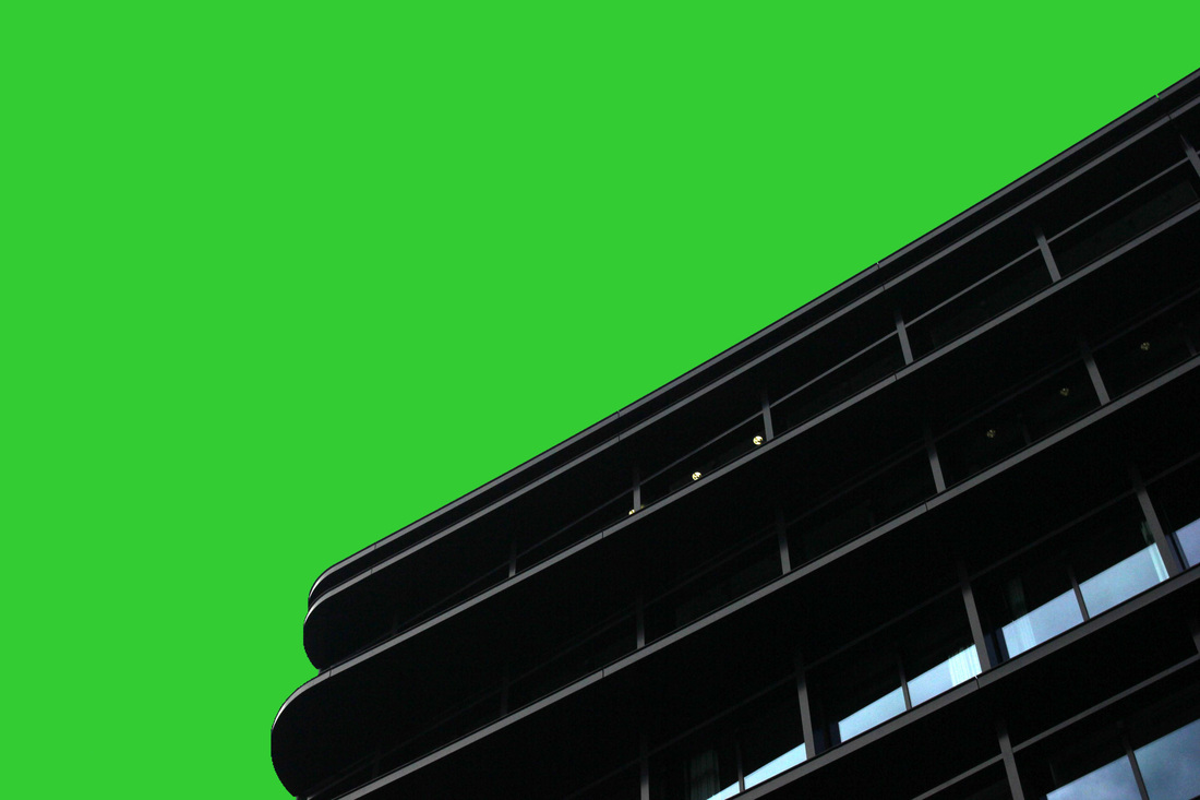
Here are the four images I have decided to use as my final piece.

|


|
I will present them as a final piece by placing them next to each other with a black background which would make the buildings stand out more, as you can see above.
